-
I want to thank all the members that have upgraded your accounts. I truly appreciate your support of the site monetarily. Supporting the site keeps this site up and running as a lot of work daily goes on behind the scenes. Click to Support Signs101 ...
You are using an out of date browser. It may not display this or other websites correctly.
You should upgrade or use an alternative browser.
You should upgrade or use an alternative browser.
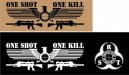
Sniper school shirt design
- Thread starter TyrantDesigner
- Start date
SignManiac
New Member
I like it.
TyrantDesigner
Art! Hot and fresh.
Is this a civilian sniper school?
Not really ... it's for the Pantex sniper school ... nuke assembly and break down plant ... sniper school is for their snipers to stay sharp and make sure no one gets funny ideas.
Wtf?
It might just be me, but.... WTF?
Make sure you stay on their good side brother.
It might just be me, but.... WTF?
Make sure you stay on their good side brother.
Not really ... it's for the Pantex sniper school ... nuke assembly and break down plant ... sniper school is for their snipers to stay sharp and make sure no one gets funny ideas.
TyrantDesigner
Art! Hot and fresh.
That looks really good to me other than the missing stars. But it would be hard to incorporate all 50.. Thank you for getting the stripes correct. It seems that a lot of people have trouble with that.
I actually included all 50, but with it being partially obscured I made the design choice to make it look good vs being completely visible and to not read as tiny dots. But yeah, you have to have the stripes right even if you have to fudge the stars around a little. while the coloring isn't there, needed to make sure the space between the 'feathers' would read as the second color of stripes in between. But the stripe thing always drives me nuts, especially when it's a tattoo and it's supposed to be an actual flag but has 19 stripes or stars on the bottom. what is fun is when you count the stars cause you're bored and that American flag on a shirt has 42 stars but doesn't understand why their shirt is not correct.
TyrantDesigner
Art! Hot and fresh.
It might just be me, but.... WTF?
Make sure you stay on their good side brother.
My childhood best friend was a sniper ... they are all great guys that serve an important purpose. (couple nuts, but far less than chance of that than riding the bus)
Besides, Pantex brings a lot of work to this area (and a lot of protesters) both of which spend money in the area so I'm making sure I give them the best custom design work I can for the service they do as protection.
Marlene
New Member
The only thing I don't like is that there are two guns on a shirt that reads ONE SHOT, it only needs one gun, in the center on the bottom.
the one gun also balances the layout better than chucking two guns side by side as that is just too much mirror image and it needs it
graphicwarning
New Member
I'm not sure about the two guns myself, but the rest doesn't seem too bad.
I had a cousin that was a designated marksman in the Marine Corps, and he had a shirt I always chuckled at... it said "Don't run, you'll only die tired" hahaha
I had a cousin that was a designated marksman in the Marine Corps, and he had a shirt I always chuckled at... it said "Don't run, you'll only die tired" hahaha
bob
It's better to have two hands than one glove.
This looks like something out of a high school mechanical drawing class.
It's a bunch of stuff in a symmetrical arrangement, seldom a good idea, where everything is just floating around. The gun silhouettes are far too complex and, other that some anal urge for symmetry, why two of them? The eagle thing looks like something that fell off a Nazi flag. The type face is completely predictable and thus passe. The weights of the text, the eagle thing, and the guns, vary sufficiently to create visual discord which then fights with the attempted symmetry of the thing.
It has no soul, no feel. It looks like a collection of clip-art in a primitive child-like arrangement.
SlightlyChilled
New Member

Locals Find!
New Member
The one shot one kill slogan is way over used. Also, the guys your describing sound more like designated marksmen than snipers. Snipers by their very definition hide, crawl around, then wait days for a kill shot. The guys your describing probably have designated posts and work shifts or deploy when there is a needed incident.
Not knocking the guys doing the job just don't like it when I see a term like "sniper" used for every guy taking a shot further than 300 yards.
Not knocking the guys doing the job just don't like it when I see a term like "sniper" used for every guy taking a shot further than 300 yards.
Techman
New Member
The guys your
It's YOU'RE...
Locals Find!
New Member
It's YOU'RE...
Sue me! I am not a grammar expert and never claimed to be one. If that is all you took from my post. I pity you, for having so much time no your hands to police the grammar of this world. While your at it go police some of the other thousands of posts on here with bad grammar and even worse spelling.
GAC05
Quit buggin' me
This might provide some design inspiration for the military badass tee-shirt genre:
http://www.ryanlean.com/
wayne k
guam usa
http://www.ryanlean.com/
wayne k
guam usa