• I want to thank all the members that have upgraded your accounts. I truly appreciate your support of the site monetarily. Supporting the site keeps this site up and running as a lot of work daily goes on behind the scenes. Click to Support Signs101 ...

So let the hatin begin

racershawn

New Member
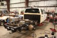
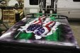
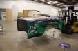
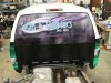
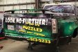
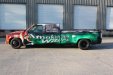
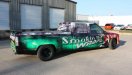
I just finished the new shop truck. Most of you all have been a lot of help deciding how to do this. I have been designing this for quite a while. What I did was listen to all the critics of several of the wrap jobs on here. I took all your rules and through most of them out the window and did about the opposite. I think this came out good, but as always there will be the lovers and the haters. For me I cannot stop at the 7-11 without being asked for a card …… In my never be humble opinion, that is the best test of a good design and a good install …… PS, I designed it all in color.
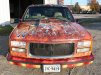
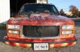
One more thing..... Black or silver rims? Seems anyone under 35 likes the black... everyone over 35 likes the silver .....
 

Attachments

  • Copy of IMG_2889.jpg
    Copy of IMG_2889.jpg
    80.8 KB · Views: 151
  • Copy of IMG_3021.jpg
    Copy of IMG_3021.jpg
    66.2 KB · Views: 117
  • Copy of IMG_3020.jpg
    Copy of IMG_3020.jpg
    60.6 KB · Views: 116
  • Copy of IMG_3086.jpg
    Copy of IMG_3086.jpg
    68.4 KB · Views: 100
  • Copy of IMG_3126.jpg
    Copy of IMG_3126.jpg
    116.5 KB · Views: 120
  • Copy of IMG_3025.jpg
    Copy of IMG_3025.jpg
    69.8 KB · Views: 116
  • Copy of IMG_3066.jpg
    Copy of IMG_3066.jpg
    77.1 KB · Views: 99
  • Copy of IMG_3096.jpg
    Copy of IMG_3096.jpg
    77.7 KB · Views: 132
  • Copy of IMG_3127.jpg
    Copy of IMG_3127.jpg
    100.9 KB · Views: 104
  • Copy of IMG_3109.jpg
    Copy of IMG_3109.jpg
    60 KB · Views: 105

GB2

Old Member
Well, I'll tell you what I do like here...your confident attitude...you made a decision and your standing by it...good for you! I'm not sure the truck design would be right for me but like you say, if you feel it's working for you then it's good. At first I thought the black rims just looked unfinished but after looking a little closer they may be right for this truck. I'm having a hard time picturing silver rims after seeing the black.
 

racershawn

New Member
well thank you for that..... that coment means more to me then the design ... silver was ok but the black kinda grows on you and the pinstripe i added made all the differance in the world.. also the spike lugnut covers are not on yet ... now they are kewl!
 

Flame

New Member
It'll get attention... just like a car covered in tin cans and toilet paper. Of course people are going to come up and ask about it....

Sheesh. That's horrible dude.
 

GK

New Member
Well, I must say -- the quality of the install looks pretty great. I can't imagine doing this type of bed off removal to a customers vehicle however, it looks like you did not come close to cutting any corners and then went a step further wrapping the spoiler on the tonneau cover. The design although it mostly looks like fills, patterns, and microstock makes you look which is definitely what you want but its clashing with the copy (very difficult to read). I would have to imagine you are trying to draw the custom car/race clientele so I would say regarding the rims -- black center with a big fat polished lip in the rear's and a smaller polished lip up front -- this way the rims don't look too black and fade into the wrap itself. Take this constructively, not meant to bash. It is definitely not everyone's cup of tea, and the fonts could have used some work but if you are getting stopped and ask for cards AND get jobs out of it -- well, you did something right.
 

klmjff

New Member
"It'll get attention... just like a car covered in tin cans and toilet paper. Of course people are going to come up and ask about it....

Sheesh. That's horrible dude."


cmon Flamer....its not THAT bad. What about some constructive criticism?
 

Biker Scout

New Member
I like it, but I don't...

Let me explain. The execution of the wrap is outstanding. However, it's got every cliché wrap effect thrown on there and bad choice of fonts. Did I see Brush Script? *UGGH*

What it looks like to me is that you went through your library of wrap background and effects and just started melding things until you found what looked to be in your eyes appealing and stands out.

Stands out it does, and no doubt you will get a lot of work from it. But coming from a design standpoint, you won't win any awards. But from a marketing standpoint reaching a certain demographic, you've nailed it!

So good job, and I hope it brings you a lot of business! (It won't win you any awards or accolades from designers, however)
 

Flame

New Member
"It'll get attention... just like a car covered in tin cans and toilet paper. Of course people are going to come up and ask about it....

Sheesh. That's horrible dude."


cmon Flamer....its not THAT bad. What about some constructive criticism?

Start over? I have nothing against the dude other than he knew this was coming and still posted it. We all have bad designs and I know I've done my share of them but this is a special effect nightmare.
 

Artildawn

New Member
Well I've seen worse and if the crowd at 7-11 is your target market then its a success.

I can appreciate the amount of work you put into it even if the design doesn't resonate with me.
 

acothran

New Member
I think the Aurora Graphics catalog threw up on your truck. From the pics it looks like a clean installation. Not my style but thanks for sharing. I do think it's funny that you incorporated a personal pic of you "installing" the wrap.

Allen
 

GAC05

Quit buggin' me
Not my taste, but I am getting old and grumpy.
Comments:
The kerning of the main text on the side looks off (un-even & too far apart) makes the lettering look thin and weak for such a large truck.
The front works the least for me, looks like you just finished running over the Domino's delivery guy.
(think I have said this same thing before to someone on this board)

If it is doing what you want it to do, then my hat's off to you as it looks like you put a ton of work into it.

wayne k
guam usa
 

astro8

New Member
C'mon man...I been sittin' here for the last 5 minutes trying to think up something positive to say...but I can't, except that if you put as much work into the design as you did the install, you might have accomplished something outstanding but instead it's the most atrocious looking piece of 'signwork' I've seen for a long time and does nothing to further the wrap market...it's nothing more than mobile graffitti.

You 'took all the rules and threw them out the window'?..."did the opposite'?

You 'think it looks good'?...sorry brother you and I are on different trips.
 

Bly

New Member
I reckon good on you man.

It gets noticed - and I'm sure most of the public aren't design experts unlike most on here.

Got any work out of it?
 

Rising

New Member
Well it certainly isn't what I would want for our company vehicle, not by a lonnng way.

Also,
- the text on the sides do not work
- dont like the word 'hot' smaller
- 'smokin' text is very odd, the i and n look diff from rest
- why is the word 'signs completely isolated and randomly lost on the wing.

but you know YOUR company best eh.

Good luck, prove us doubters wrong and make a million.

Steve
 
Top