• I want to thank all the members that have upgraded your accounts. I truly appreciate your support of the site monetarily. Supporting the site keeps this site up and running as a lot of work daily goes on behind the scenes. Click to Support Signs101 ...

Thoughts?

Status
Not open for further replies.

Locals Find!

New Member
Here are 3 different ideas for logos I am working on for a client. He knows I am using royalty free clip art for part of the logo.

I just don't know if I like any of them, and am looking for some feedback to maybe improve upon them.

Throwing them out and starting over isn't really an option as well I threw out quite a few to get to this point.

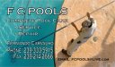
The last image is the clients current business card and magnet design.
 

Attachments

  • LOGO.jpg
    LOGO.jpg
    83.9 KB · Views: 352
  • logo-revised.jpg
    logo-revised.jpg
    37.9 KB · Views: 127
  • logo3.jpg
    logo3.jpg
    31.9 KB · Views: 120
  • LOGO4.jpg
    LOGO4.jpg
    31 KB · Views: 148
  • side1-businesscard.jpg
    side1-businesscard.jpg
    221.4 KB · Views: 135

Gino

Premium Subscriber
As far as creating a logo.... none of them, whatsoever.

If this is a business card, the last one will get by, but change the font. Copperplate there.... looks terrible.
 

Locals Find!

New Member
As far as creating a logo.... none of them, whatsoever.

If this is a business card, the last one will get by, but change the font. Copperplate there.... looks terrible.

We already created the business card the last image. Its from when I first started out and your right that font looks horrible. I have learned better since then, however the client wants to actually have some kinda branding now. That isn't just his name in copperplate.

Any salvation for any of those?? I really just can't seem to get something spectacular to come into my head with what I have to work with.
 

CanuckSigns

Active Member
I have to agree with Gino on this, none of these look very appealing. If you are charging what you should for logo design, you should have no problem having a designer create something much more professional for you and still make some money on the job.
 

Locals Find!

New Member
I have to agree with Gino on this, none of these look very appealing. If you are charging what you should for logo design, you should have no problem having a designer create something much more professional for you and still make some money on the job.

Well, I am open to that as an option. Anyone wanna toss a sketch out their of what they are thinking & price I will be glad to present it to the client.

Here is what I have to work with "FC POOLS" thats it that is all the information I had to work from. If anyone thinks they can do better and wants to get paid for it let me know.
 

HulkSmash

New Member
Addy, I know you are trying to better your skills in the design area...which i respect, but i have to be brutally honest - Practice on your own, with your own practice logos.. please don't make people pay for stuff like this, it's just terrible. There are no suggestions on how to fix it, just start over...............
 

Gino

Premium Subscriber
Coming from me, Addie..... it's gonna be taken the wrong way, but since you asked.......

Possibly using the oval will help and staying with some blue will give the sense of water. However, your use of the large and small letters and interchanging elements is completely lost. It has the feel of a rather elementary type level and should not be considered for any kind of payment if they are forced to use one of these or some reasonable fact simile of any of them.

Look through the phone book for some ideas...... and don't steal others work. Get ideas or food for thought. You're trying to compete in a world where you barely have any basics and you want to have finished works of art. Ain't gonna happen. Either hire someone to do it for you and pass the costs along, or continue down your path of guileless cartoons.


It will happen, just don't force it. At least not on this one, yet. Possibly you don't have any creative juices flowing. :bushmill:
 

Gino

Premium Subscriber
Well, I am open to that as an option. Anyone wanna toss a sketch out their of what they are thinking & price I will be glad to present it to the client.

Here is what I have to work with "FC POOLS" thats it that is all the information I had to work from. If anyone thinks they can do better and wants to get paid for it let me know.


See, this is just plain wrong. This is why it's hard to help you. You come off sounding cheesy. If you want to fit in.... not just to s101, but the rest of society..... you must do what everyone else does....... Hire and pay for the job. You don't ask for free handouts and have 25 conditions connected to it. That's low and deceitful.... all the way.
 

CanuckSigns

Active Member
Well, I am open to that as an option. Anyone wanna toss a sketch out their of what they are thinking & price I will be glad to present it to the client.

Here is what I have to work with "FC POOLS" thats it that is all the information I had to work from. If anyone thinks they can do better and wants to get paid for it let me know.

I don't think you are going to find any professionals willing to work on a "Design me something and if i like it I will pay you" basis, you would be better off asking to see someones portfolio, and if you like their style and think it would work well for this companies logo, ask for pricing.
 

Locals Find!

New Member
Coming from me, Addie..... it's gonna be taken the wrong way, but since you asked.......

Possibly using the oval will help and staying with some blue will give the sense of water. However, your use of the large and small letters and interchanging elements is completely lost. It has the feel of a rather elementary type level and should not be considered for any kind of payment if they are forced to use one of these or some reasonable fact simile of any of them.

Look through the phone book for some ideas...... and don't steal others work. Get ideas or food for thought. You're trying to compete in a world where you barely have any basics and you want to have finished works of art. Ain't gonna happen. Either hire someone to do it for you and pass the costs along, or continue down your path of guileless cartoons.


It will happen, just don't force it. At least not on this one, yet. Possibly you don't have any creative juices flowing. :bushmill:

Your right Gino I can't get any juices flowing. I can't wrap my head around that FC. I could come up with so much better if I had a whole name or two to work with. The client isn't going to refile all his corporation paperwork just so I can make a better looking logo though.

The diving board thing was the best I could come up with with those two letters.

Anyone wanna take a crack at this and jot some thoughts down. I am open to subbing out this job. Here at least I know you guys will come up with something good and not steal my client from under me.
 

HulkSmash

New Member
See, this is just plain wrong. This is why it's hard to help you. You come off sounding cheesy. If you want to fit in.... not just to s101, but the rest of society..... you must do what everyone else does....... Hire and pay for the job. You don't ask for free handouts and have 25 conditions connected to it. That's low and deceitful.... all the way.

I think he was offering to pay gino
 

CanuckSigns

Active Member
Your right Gino I can't get any juices flowing. I can't wrap my head around that FC. I could come up with so much better if I had a whole name or two to work with. The client isn't going to refile all his corporation paperwork just so I can make a better looking logo though.

The diving board thing was the best I could come up with with those two letters.

Anyone wanna take a crack at this and jot some thoughts down. I am open to subbing out this job. Here at least I know you guys will come up with something good and not steal my client from under me.


Why are you under the impression that you need to turn the letters "into something"?
 

Locals Find!

New Member
See, this is just plain wrong. This is why it's hard to help you. You come off sounding cheesy. If you want to fit in.... not just to s101, but the rest of society..... you must do what everyone else does....... Hire and pay for the job. You don't ask for free handouts and have 25 conditions connected to it. That's low and deceitful.... all the way.

I don't think you are going to find any professionals willing to work on a "Design me something and if i like it I will pay you" basis, you would be better off asking to see someones portfolio, and if you like their style and think it would work well for this companies logo, ask for pricing.

I am being mis-understood here. I am saying if anyone wants to do like Doug does with a quick pencil and post-it slap down an idea of what they are thinking I will take them to the client. Not asking anyone to fire up their machines and spend any real time working on anything for free.

Honestly, I can't go to my client and say give me a $500 deposit and I am going to hire this guy to design you something without some idea of whether he is even going to like it. If anyone interested has a link to a portfolio online or something I can share that would work too. I am just trying to do right by my client at this point and get him his logo.
 

SignManiac

New Member
There are a few great designers here on 101. Get a budget from the client for designing a logo and then see if it's enough to hire somebody. If the client isn't willing to pay for a great branded logo, then give him this one for free from me.
 

Attachments

  • fcpools.jpg
    fcpools.jpg
    31.3 KB · Views: 138

HulkSmash

New Member
I'm going to give you a quick lessons in graphic design. I got my masters in graphic design print design, which isn't an easy task.

One common mistake non designers make - They always try to make their logos literal. for example - you. FC pools.. you automatically want to put a blue circle in there representing a pool. it's gross - Think outside the box. Make yourself a tree graph. Start with the name pool, and just every single thing you can associate with pool branch off. and do the same to the examples you come up with until you have a hefty list of things that have to do with pools.. that aren't exactly pools. examples are diving boards, water, blue, fun, swim etc etc etc.
Designing takes more thought process than most think. Hope this helps.

attached is 20 second example of a FCpool logo - of what i mean. Using a graph you can come up with water, and from water to water drops. Something different...


this logo i made isnt meant to be good, just to show an example of how you can be versatile. needs a new font......
 

Attachments

  • ppool.jpg
    ppool.jpg
    16.5 KB · Views: 128

Locals Find!

New Member
I'm going to give you a quick lessons in graphic design. I got my masters in graphic design print design, which isn't an easy task.

One common mistake non designers make - They always try to make their logos literal. for example - you. FC pools.. you automatically want to put a blue circle in there representing a pool. it's gross - Think outside the box. Make yourself a tree graph. Start with the name pool, and just every single thing you can associate with pool branch off. and do the same to the examples you come up with until you have a hefty list of things that have to do with pools.. that aren't exactly pools. examples are diving boards, water, blue, fun, swim etc etc etc.
Designing takes more thought process than most think. Hope this helps.

attached is 20 second example of a FCpool logo - of what i mean. Using a graph you can come up with water, and from water to water drops. Something different...


this logo i made isnt meant to be good, just to show an example of how you can be versatile. needs a new font......

Thanks for the tip. I am going to experiment with that later tonight just for fun with my company name. The shield is getting old.
 
Status
Not open for further replies.
Top