• I want to thank all the members that have upgraded your accounts. I truly appreciate your support of the site monetarily. Supporting the site keeps this site up and running as a lot of work daily goes on behind the scenes. Click to Support Signs101 ...

Trying new ideas

jkdbjj

New Member
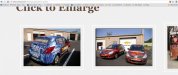
So this isn't live yet, but after showing my initial ideas for the site, I changed it a lot. Two screen shots to show the basic layout.

The top section with my logo to the left I feel is a little empty at this point, so I want to work on that.

All images are my work, so I hope that helps a little.

Thoughts on the color scheme and layout? Is the verbiage straight forward enough?

Thanks.

shot1.jpg shot2.jpg
 

JTBoh

I sell signage and signage accessories.
Hired model or friend/family/employee? Any which way - make printers sexy +1
 

Gino

Premium Subscriber
Is that a professional model or your wife or who ?? In other words, is that photo from within your shop or are you borrowing it ??

Otherwise, all looks rather nice.
 

jkdbjj

New Member
Ooops! I did say that all photos are my own. Sheesh with the exception of that woman! She is an HP model at an expo for HP. Sorry guys. However, my wife is that hot! he he he
 

jkdbjj

New Member
I did mention at the beginning of this thread that I need to put something in the blue area. That is sort of fine tuning the project and I will decide what to put there. Do you have any suggestions?

So, I am providing a link to the actual test site, which is NOT live to the public so to speak. There ARE typos still and a TON of content to be added still, but I wanted you to be able to play with it to give some actual feedback.

Thanks guys and gals.

http://vivisual.com/testing/

Also, I have to add all the data and links to the bottom of the page footer. So still lots to do. I hope in another week or two.
 

signswi

New Member
Putting a call to action there was the suggestion. :thumb: What you want that action to be is up to you and your conversion campaign / techniques.

1) Not a fan of sliders -- they don't work, people don't use them or view them. Lots of research on this. Use that area for one, non-rotating BIG IDEA. For easy changeout you can leave it as that slider code-wise, just don't put up more than one slide.

2) Home should be all the way to the left in the navigation, not on the right. Contact should be all the way on the right. Don't violate user expectations.

3) Suppliers (3M, etc.) in the bottom should be reversed out to white or something that doesn't cause vibrance issues against blue

4) Get rid of the social media buttons, fine to use them in a blog post but they're just annoying clutter on a page, especially a front page.

5) Put useful information in your footer. At minimum: your physical address and phone number. Hours of operation are also good.

6) Consider calling your blog something other than Blog. No one cares about a company Blog. They may however care about company News.

7) The link "Company" I assume is going to be a link to your about page...call it About or About Us, not Company. Don't violate user expectations.
 

jkdbjj

New Member
Thanks signswi. How about get a quote now button up there? Too much?
Or I can put some more sample pics, but I do to want to over do that either.
 

jkdbjj

New Member
FYI, I am going to have realtime shopping as well so the customer can place orders online and get quotes etc...

So maybe a "shop now" in the upper blue. Or maybe specials. Or perhaps experiment and see what users respond to after a week or two of each blue section?

Anyway thanks.
 

signswi

New Member
I'll add that your About page is the second most important page, don't just fill it with straight "We are these guys", use it as another sales conversion opportunity. Sell yourselves and interlink to galleries and sales pages where appropriate and natural. Plus it should have physical address and phone number and email info all easily found, again, even though it's already in the footer on every page. That stuff is so important people should be slapped in the face with how easy it is to find it.
 

jkdbjj

New Member
Putting a call to action there was the suggestion. :thumb: What you want that action to be is up to you and your conversion campaign / techniques.

1) Not a fan of sliders -- they don't work, people don't use them or view them. Lots of research on this. Use that area for one, non-rotating BIG IDEA. For easy changeout you can leave it as that slider code-wise, just don't put up more than one slide.

2) Home should be all the way to the left in the navigation, not on the right. Contact should be all the way on the right. Don't violate user expectations.

3) Suppliers (3M, etc.) in the bottom should be reversed out to white or something that doesn't cause vibrance issues against blue

4) Get rid of the social media buttons, fine to use them in a blog post but they're just annoying clutter on a page, especially a front page.

5) Put useful information in your footer. At minimum: your physical address and phone number. Hours of operation are also good.

6) Consider calling your blog something other than Blog. No one cares about a company Blog. They may however care about company News.

7) The link "Company" I assume is going to be a link to your about page...call it About or About Us, not Company. Don't violate user expectations.
Point 1: I will have to give that some thought! For example when I am on Dell's website I live the slider. My wife also said Disney uses it and she loves it. So I will need to do some research to decide "if" I am going to use it, how to use it well. Thanks for the heads up.

Point 2: The new standard is the the home button is eliminated because study shows most people know the logo takes you back home. See www.walmart.com and others are doing it. So, based on that trend I decided to at least put it off to the right. Any thoughts, now that I explained it that way? I am not set one way or the other, and I totally understand where you are coming from.

Point 3: Yes, the footer logos, I just took from my current website, so I agree they need work! The whole bottom does!

Point 4: Social media... Hmm... Well I suppose I agree with you. I just wonder if it should be used on the gallery and other interesting pages. I also have a media/video page I am creating that shows installs etc... I think social links will be good for that.
If they are on the home page, they should be attached to something particularly interesting. I will give it some more thought though! I do agree the home page should be as friendly and inviting as possible, so less clutter probably helps.

Point 5: Yes I have lots of work to do on the footer. I'll let you know when it is done if that is OK.

Point 6: I never thought about that for the blog. Thanks again, I'll have to do more research on that as well it seems!

Point 7: Under company, I am going to have the following drop downs. "about us", and "careers". So does that make it different for you if I do that? Otherwise I don't mind seperating About Us and Careers as seperate menu items.

Thanks again! very helpful
 

jkdbjj

New Member
So, I've got the site live http://www.vivisual.com now for the most part. Still a ton to do. It is probably a mistake to go live, but my old site was so very bad. I have hardly any visitors as it is, so it shouldn't be a big deal.

I have added a lot to the portfolio, and still have about 15 pages to create, maybe less.

Thanks for the feedback signswi.
 

jkdbjj

New Member
Thoughts on the portfolio? I was going to break it down by discipline or category, but decided to just throw it all in at once, yet still organized somewhat. Banners with banners, vehicles with vehicles etc...

Mistake?
 

JERHEMI

New Member
Thoughts on the portfolio? I was going to break it down by discipline or category, but decided to just throw it all in at once, yet still organized somewhat. Banners with banners, vehicles with vehicles etc...

Mistake?

Your portfolio takes wayyyy too long to load!
 

jkdbjj

New Member
Your portfolio takes wayyyy too long to load!

Thanks! Just realized about 10 images are over 300kb, while the rest are about 60kb. Not sure what caused that but I'll change that this evening and repost. Would you mind checking again after I do that?
 

qmr55

New Member
Use lower quality images for the thumbnails, and use the images you have for the thumbnails now for the actual image once it is clicked.

The attached image is zoomed in using my browser's zoom feature, notice that even zoomed in the image loses no quality at all. Normally zoomed in 500% on an image on a website will kill the quality, hence why no one zooms in that far. Tune the images down a little so they load faster
 

Attachments

  • Untitled.jpg
    Untitled.jpg
    40.3 KB · Views: 154

jkdbjj

New Member
Use lower quality images for the thumbnails, and use the images you have for the thumbnails now for the actual image once it is clicked.

The attached image is zoomed in using my browser's zoom feature, notice that even zoomed in the image loses no quality at all. Normally zoomed in 500% on an image on a website will kill the quality, hence why no one zooms in that far. Tune the images down a little so they load faster
Exactly! I'll address it this evening. Thanks!
 
Top