• I want to thank all the members that have upgraded your accounts. I truly appreciate your support of the site monetarily. Supporting the site keeps this site up and running as a lot of work daily goes on behind the scenes. Click to Support Signs101 ...

Need Help Two Colors, One Pantone, Same Document

lolfailure

New Member
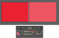
Has anyone encountered this? A client sent me a logo file consisting of two lines of text. Top is a light gray and bottom is a dark gray. However, they both are set to PMS 433U. HSB, RGB, CMYK all the same numbers, transparency and blend mode the same, but colors visually are clearly different. What's going on here?
 

Attachments

  • Capture.JPG
    Capture.JPG
    14.8 KB · Views: 424
Last edited:

JTBoh

I sell signage and signage accessories.
I'd ask the customer what they prefer, and if it is intended.

As long as there are no cups involved I think you'll be OK.
 

lolfailure

New Member
I'd ask the customer what they prefer, and if it is intended.

As long as there are no cups involved I think you'll be OK.

The trouble there is that the customer is clueless. Someone else designed it and they've "never had this problem before" but of course they also insist accuracy is completely crucial.

I've noticed that if I change the swatch of the lighter grey to another spot color it retains the lightened appearance. I swapped them both to roland's contour cut swatch and got what is shown in my attachment. It really seems like the transparency has been adjusted but the appearance panel shows everything as default.

I don't know what you mean about cups, sorry.
 

Attachments

  • Capture.JPG
    Capture.JPG
    8.3 KB · Views: 382

Solventinkjet

DIY Printer Fixing Guide
When using pantone colors, usually you can set a percentage for how light or dark you want the color. This is used a lot on packaging because if you are limited to using 1 or 2 colors for the design, you can get the effect of more colors by using different percentages of the same color. If you are using illustrator it should just be in your swatch tool box. Just like setting CMYK values, it's a percentage of a pantone color instead.
 

lolfailure

New Member
When using pantone colors, usually you can set a percentage for how light or dark you want the color. This is used a lot on packaging because if you are limited to using 1 or 2 colors for the design, you can get the effect of more colors by using different percentages of the same color. If you are using illustrator it should just be in your swatch tool box. Just like setting CMYK values, it's a percentage of a pantone color instead.

Ah okay, I found it. In case anyone else stumbles on this it's under the Color panel, not the Swatches panel and you have to use the dropdown to Show Options to view the percentage slider. Thanks for the help!
 

DerbyCitySignGuy

New Member
[Edit: I see that you found it on your own! Nevermind.]

Which one matches the PMS book?

VanderJ hit the nail on the head. This is what you're looking for:
 

Attachments

  • thisrighthere.png
    thisrighthere.png
    6.3 KB · Views: 353

shoresigns

New Member
When using pantone colors, usually you can set a percentage for how light or dark you want the color.

percentage thing.

it's under the Color panel, not the Swatches panel and you have to use the dropdown to Show Options to view the percentage slider.

When you set a "percentage" of a spot colour, it's called a tint. That's why there's a T on the left side of the percentage slider. Another term you might hear for this is screen value, which is an older term that refers to when you use halftone screens to produce a lighter tint of a spot colour.
 

bannertime

Active Member
Also, just in case someone runs into this problem and it's not the tint. Try ungrouping or going into the group and checking the transparency options there. Grouped items get a single handler for opacity and blending that is set to default.
 

lolfailure

New Member
When you set a "percentage" of a spot colour, it's called a tint. That's why there's a T on the left side of the percentage slider. Another term you might hear for this is screen value, which is an older term that refers to when you use halftone screens to produce a lighter tint of a spot colour.

It displays the tint value as a percentage, which is why we are all referring to it that way.
 

Andy_warp

New Member
It displays the tint value as a percentage, which is why we are all referring to it that way.
Well...a tint is the proper terminology.

Pantone used to have specific books that showed all of the tints of each spot color in the set in 10 percent increments.
Another thing you should know is that is why you don't use a tint in anything other than a 10 percent increment.
There is an actual physical reference which reinforces Pantone's whole idea!

I hate to see some of the old school printers try to help someone out and then get snark after you found your quick answer.
 
Top