• I want to thank all the members that have upgraded your accounts. I truly appreciate your support of the site monetarily. Supporting the site keeps this site up and running as a lot of work daily goes on behind the scenes. Click to Support Signs101 ...

What Is A Good Bold Font For A Power Sports Repair Shop?

player

New Member
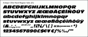
I am looking for suggestions for a bold easy to read font for a power sports parts sales and service business?

I need a typeface for the business name, as well for the list of services. This is for an outdoor pylon and needs to be read from the road.

Anything come to mind?

Thanks...
 

Gino

Premium Subscriber
If you don't hafta follow suit as to what's already there, the olive nord family is bold. Has a sturdy look to it.
 

player

New Member
Nice! Good pick Geno.

attachment.php
 

Attachments

  • URW20840-1a029023d.gif
    URW20840-1a029023d.gif
    10.3 KB · Views: 220

Gino

Premium Subscriber
However, I would not use the italics. Any font shows or emphasizes more strength when standing tall and straight...... not bent over. Italicized tend to show speed or movement, thus race cars, police cars and all those other fast vehicles.
 

bob

It's better to have two hands than one glove.
The Olive Nord is bit too cartoon like and the boldness is forced to the point of illegibility. Notwithstanding that it's butt-ugly to boot.

Bold doesn't necessarily mean sans serif. If it were mine to play with I might be moved to try something like LHF MIkes Block, which appears to be a Rockwell derivative. Play with it, try some different looks.

Whatever you do, make a statement. Don't just go with something that looks as if it evolved from grocery store weekly sale banners.
 

player

New Member
Thanks for the suggestions.

The business is in power sports, which is ATV's, jet skiis, speedboats etc.
 

peavey123

New Member
Trasandia
LHF Boot Camp
LHF Tallington
Uniwars (futuristic look that could work)
+1 to LHF Mikes Block for a nice bold serif font.
 

Rick

Certified Enneadecagon Designer
I can give you hundreds of suggestions but:

What are they called? Some typefaces look better than others depending on what the name is (I know, you probably don't want to reveal that)
If you are going to have the name AND list services, you might want a typeface with a lot of weights choices...
What does the pylon structure look like (or going to look like)
The space where the type goes?

and the biggest question...

Do they have a logo?
 

player

New Member
I can give you hundreds of suggestions but:

What are they called? Some typefaces look better than others depending on what the name is (I know, you probably don't want to reveal that)
If you are going to have the name AND list services, you might want a typeface with a lot of weights choices...
What does the pylon structure look like (or going to look like)
The space where the type goes?

and the biggest question...

Do they have a logo?

Your are correct that I don't want to reveal the name...

The pylon is 2 round metal posts that hold 2 4 x 8's stacked, and is about 20' high.

No logo, the sporty font will be the logo... But everything needs to be legible as cars speed by at 50 mph.
 

Fred Weiss

Merchant Member
... But everything needs to be legible as cars speed by at 50 mph.

Keep in mind that medium weights are more legible than bold weights although bold is better for catching the eye. The most legible fonts also have an average height to width ratio of 90%.
 
Top