I want to thank all the members that have upgraded your accounts. I truly appreciate your support of the site monetarily. Supporting the site keeps this site up and running as a lot of work daily goes on behind the scenes.
Click to Support Signs101 ...
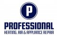
The first one has a nice bold retro look. The "P" will transfer well to letterhead, envelopes etc. Yup, we still use that stuff.
It is sometimes easy to forget that a logo has to be useful across many types of media. You haven't made that mistake. Rock on!
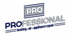
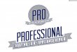
Just FYI, in both 2 & 3, the wordmark is meant to be used separately from the icon for different applications. I know I didn't screenshot that very well
I like the third one, but try making the shadow on the words "Heating • Air • Appliance Repair" a light gray maybe like 10-20% black and see how that looks. I think the blue shadowing over takes the white text and makes it insanely hard to read.
This site uses cookies to help personalise content, tailor your experience and to keep you logged in if you register.
By continuing to use this site, you are consenting to our use of cookies.