-
I want to thank all the members that have upgraded your accounts. I truly appreciate your support of the site monetarily. Supporting the site keeps this site up and running as a lot of work daily goes on behind the scenes. Click to Support Signs101 ...
You are using an out of date browser. It may not display this or other websites correctly.
You should upgrade or use an alternative browser.
You should upgrade or use an alternative browser.
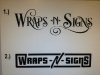
2 logo ideas. Need help with direction
- Thread starter trimitbyrich
- Start date
Joe Diaz
New Member
We are moving our shop this month and would like a whole new look and attitude with the move including a new logo. Just need help to decide which direction. Old school vs new school!
I think new-school works better with newer technology. If you were providing hand painted services instead of wraps, old-school would be the way to go.

Biker Scout
New Member
uhh... neither
trimitbyrich
New Member
Old logo

synergy_jim
New Member
not in love with either, but #2 is better
J Hill Designs
New Member
Im just a bit befuddled that your computer cant export jpgs
Im on the 'neither' boat as well, btw
Im on the 'neither' boat as well, btw
Marlene
New Member
well, do have to say not a bod idea to upgrade your logo fro what you had. the paint brush has been done to death. are you more of a wrap shop or signs shop? what kind of signs do you make? classic, carved or lighted/LED type? try to find something that fits your image. if you are middle of the road meaning a mix of classic and screaming skulls/diamond plate wraps, maybe something simple that fits for both
trimitbyrich
New Member
We do a lot of wraps for businesses. Very few skulls and diamond plate. Our business is 50% signs 50% wraps. Mostly digitally printed signs. We also do custom auto graphics and the like. Just looking for a new direction.
Marlene
New Member
try a few things that have a more modern feel to them. go to bing.com and just look at logos to get an idea of what works for other companies, not just sign shop logos, but logos in general. see what gives you a visual image of the type of business you are. you know your business better than anyone does, does either of the layouts you posted really convey to the public what you want them to?
here's a page off from a bing search for "logos"/images. the Safeguard logo ends it's name with a bolder font version to convey strength. "always" looks girly but covergirl, which is also for women, went with a less girly image and has a stronger corporate look to it. Zest, Gain Cascade, Scope, Swifter, Downy, Secret and a couple of others all slant upward like they are taking you from a need to a solution when you use their products. they all convey a visual message.
here's a page off from a bing search for "logos"/images. the Safeguard logo ends it's name with a bolder font version to convey strength. "always" looks girly but covergirl, which is also for women, went with a less girly image and has a stronger corporate look to it. Zest, Gain Cascade, Scope, Swifter, Downy, Secret and a couple of others all slant upward like they are taking you from a need to a solution when you use their products. they all convey a visual message.
Attachments

Gino
Premium Subscriber
Is your name 'Trim It' or Wraps and Signs ??
I don't think the name Wraps and Signs is very catchy. It sounds like a deli that also sells signs in the back. I knew a locksmith who made more on doing sign-work then he did working at his first trade of locks and stuff. He's now gone, but his daughter now runs the stand. It's at a little farmer's market not far from where I live. Just a thought as to why the name sounds odd.
I don't think the name Wraps and Signs is very catchy. It sounds like a deli that also sells signs in the back. I knew a locksmith who made more on doing sign-work then he did working at his first trade of locks and stuff. He's now gone, but his daughter now runs the stand. It's at a little farmer's market not far from where I live. Just a thought as to why the name sounds odd.
Biker Scout
New Member
Just put a box around it! Yeah! 
