hcardwell93
New Member
Project 1: LED light cabinet
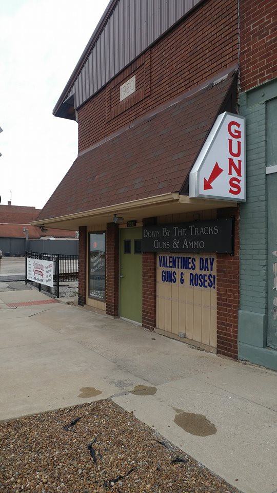
I made this sign from drops and extra material hanging around the shop. I welded up a steel frame, and riveted on ACP as I don't have a brake and shear for .040 aluminum yet. 1.25" aluminum angle iron created the retainer. Inside are some clearance Agilight Apex G1 modules with a Bebrite power supply and a photo cell.
Project 2: Hand carved sign
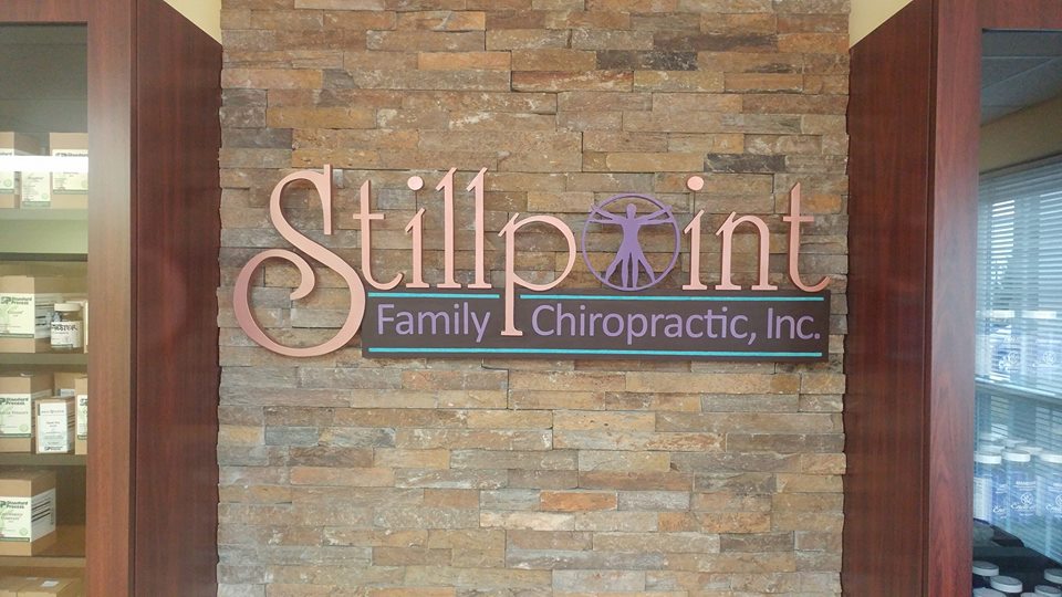
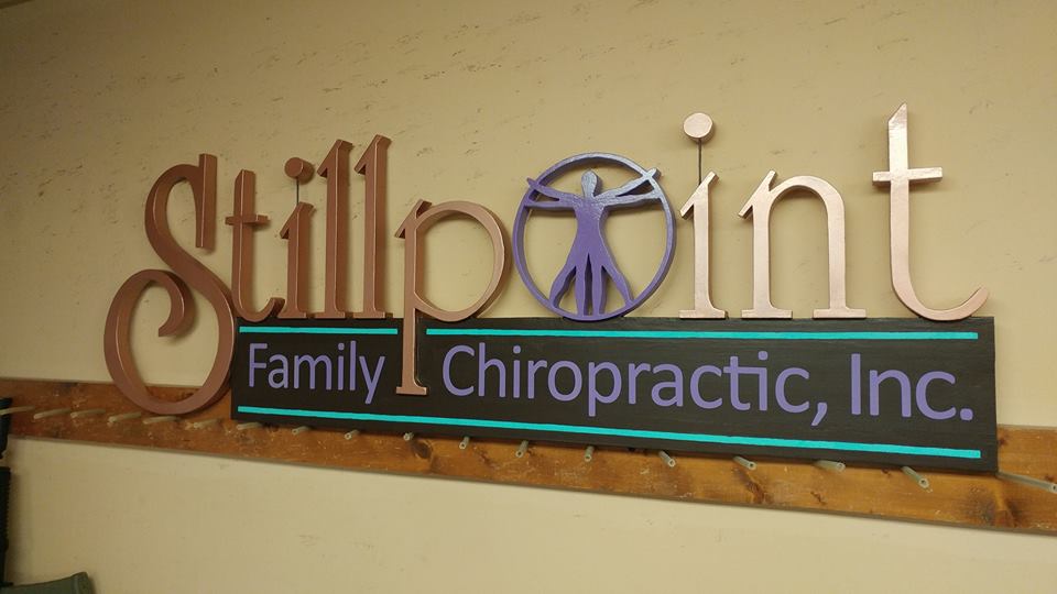
A chiropractor hired me to create a sign for her new lobby. Her main criteria was that the sign needed to have some dimension and depth to it.
I started with 3/4" HDU and laid down a template. I took a hand held router and removed 1/4" of material from the brown area, leaving the tail of the P raised. I rough cut the letters out on a scroll saw, using a spiral blade to get inside the small areas of the Vitruvian man. Followed by a little bit of work with a file and some sandpaper it was ready for paint.
I made a mistake using some Zinnser primer to start. It dries a bit rubbery and is hard to get smooth. I got a can of Jay Cooke's Sign Primer and 2 coats later I had a nicer surface to work with. The Stillpoint lettering is Rustoleum metallic copper spray paint, and the other colors are Sherwin Williams interior latex.
The sign is mounted to the wall via a French cleat. The client is very happy with the final product.


