-
I want to thank all the members that have upgraded your accounts. I truly appreciate your support of the site monetarily. Supporting the site keeps this site up and running as a lot of work daily goes on behind the scenes. Click to Support Signs101 ...
You are using an out of date browser. It may not display this or other websites correctly.
You should upgrade or use an alternative browser.
You should upgrade or use an alternative browser.
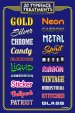
20 typeface treatments
- Thread starter Pixels Are Bad Mmmkay?
- Start date
custom sign center
New Member
You're much braver than I am!
If I put something like that in my shop someone would want me to sit down and show all of them using their name...
It's nice though.
If I put something like that in my shop someone would want me to sit down and show all of them using their name...
It's nice though.
Stanton
New Member
If I put something like that in my shop someone would want me to sit down and show all of them using their name...
:Big Laugh
Pixels Are Bad Mmmkay?
New Member
You're much braver than I am!
If I put something like that in my shop someone would want me to sit down and show all of them using their name...
It's nice though.
You know I never thought of that and you're probably right. I just think it looks cool, but if customers start going crazy with it, I may just have to move it to the screen printing room.
phototec
New Member
Nice idea, however I don't like the dark BLUE background (to dark), not enough separation between the text and background, and the blue clashes with some of the type face colors.
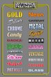
I duplicated you chart adding a neutral gray background and find it much easier to read and the separation around the edge of the text shows the type effects better (IMO).

I duplicated you chart adding a neutral gray background and find it much easier to read and the separation around the edge of the text shows the type effects better (IMO).
Attachments

Fred Weiss
Merchant Member
Just my 2¢, but I think your Typeface Treatments Chart would be much more useful if you did it all in the same typeface. Your customer might say they like Spirit the best when what they really like is the typeface.
TyrantDesigner
Art! Hot and fresh.
A little 24" x 36" poster I put together to frame and hang in the shop. What do you guys think? We need more eye candy and displays in our shop but it takes most of my free time on the weekends to create a lot of it when we get really busy.
I like the sign but would hate to have the discussions like "Well ... we CAN do carbon on bleeding cowboy BUT ... " or "Yeah, we can do gold effect ... on brush script ... well ..."
Really though. Great idea for your designers. Lets them have a reference to mix it up a little when they start getting burnt out.
synergy_jim
New Member
you'll be taking that down as soon as the first customer wastes 4 hours of your time looking at every single one of them…...
Jillbeans
New Member
I totally agree that it's going to hurt you more than help you.
If you must do it, choose a neutral dark grey background and use all the same font.
About 20 years ago I painted a large sign showing letter heights (because everyone always wanted a 6" block letter) to demonstrate just how big the letters were in person.
I ended up burning the f*cking thing one day.
Love....Jill
synergy_jim
New Member
I totally agree that it's going to hurt you more than help you.
If you must do it, choose a neutral dark grey background and use all the same font.
About 20 years ago I painted a large sign showing letter heights (because everyone always wanted a 6" block letter) to demonstrate just how big the letters were in person.
I ended up burning the f*cking thing one day.
Love....Jill
yep…. burn that mother!