-
I want to thank all the members that have upgraded your accounts. I truly appreciate your support of the site monetarily. Supporting the site keeps this site up and running as a lot of work daily goes on behind the scenes. Click to Support Signs101 ...
You are using an out of date browser. It may not display this or other websites correctly.
You should upgrade or use an alternative browser.
You should upgrade or use an alternative browser.
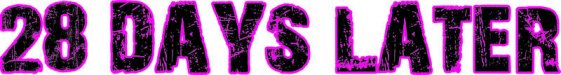
28 Days Later base font?
- Thread starter Bretbyron
- Start date

thewvsignguy
New Member
Not sure what design program you use (Flexi 10.5 here) but what I did was add an outline. The outline will hide some of those details/distortions in the font, if the lettering is lets say 3" tall I'll put a .250" outline around the text. I release the outline then add an inline to the outline so it touches the letters.
Hope it helps
Hope it helps
Bretbyron
New Member
Not sure what design program you use (Flexi 10.5 here) but what I did was add an outline. The outline will hide some of those details/distortions in the font, if the lettering is lets say 3" tall I'll put a .250" outline around the text. I release the outline then add an inline to the outline so it touches the letters.
Hope it helps
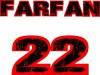
I have been doing that in Corel, but it adds so many spikes that clean-up is taking forever and not yielding great results. A version of Context Reprise might be my only hope. I'm spending Hrs. on what should be a simple print and cut job for jerseys.
thewvsignguy
New Member
Are the just the numbers?
Bretbyron
New Member
Are the just the numbers?
I wish. It' basically all of it, Front name of team and back names and #s.

Context Reprise Extra Black is really close w/ the "R" and the #'s, but the "M" isn't supposed to come all the way down.
kheebl
Member
Not sure what design program you use (Flexi 10.5 here) but what I did was add an outline. The outline will hide some of those details/distortions in the font, if the lettering is lets say 3" tall I'll put a .250" outline around the text. I release the outline then add an inline to the outline so it touches the letters.
Hope it helps
I do it kind of the same way in corel. just add a boundary around the letters, then contour around that, you can then separate the contour and delete the boundary outline.

Baz
New Member
Sounds like a nightmare to reproduce exactly like the movie title.
- What if you use one of your system fonts (say Helvetica or Arial).
- Download or create a grunge pattern to use in Photoshop (or whatever photo software you use).
Try to find something similar to the scratch pattern from the movie title.
- Type up your required names in your vector program
- Copy your names into your photo software and apply the grunge effect to the names.
- Save as individual .jpg files for each name
- Place them back in your vector program and align the vector names with the placed images.
- Create a contour cut from your vector names.
Would be one way to do it and keep everything consistent without having to alter individual letters.
Bretbyron
New Member
Sounds like a nightmare to reproduce exactly like the movie title.
- What if you use one of your system fonts (say Helvetica or Arial).
- Download or create a grunge pattern to use in Photoshop (or whatever photo software you use).
Try to find something similar to the scratch pattern from the movie title.
- Type up your required names in your vector program
- Copy your names into your photo software and apply the grunge effect to the names.
- Save as individual .jpg files for each name
- Place them back in your vector program and align the vector names with the placed images.
- Create a contour cut from your vector names.
Would be one way to do it and keep everything consistent without having to alter individual letters.
I'm trying to create a smooth contour/outline around the scratchy font for cutting. I am sure it is based on one of the basic fonts that you mentioned and I have tried several. So far Context Reprise Extra Black is the closest, but the "C" and "M" are off. I might just have to stick w/ Context Reprise and alter the ones that do not match. Hopefully it will only be the C and M.
kheebl
Member
Bretbyron
New Member
Yep, that's the one I was attaching w/ thumbnails. The customer drew it all up with that font and I have a copy, but when I contour it spikes everywhere and is taking forever to clean up and still looks horrible.


Bretbyron
New Member
Did this in like 2 min. With some time editing you could probably make it alright

It looks good, but I have 10 names and numbers plus a different design for the coaches shirts.
I got this by stretching Context Reprise Extra Black and it's a little quicker and smoother. Still going to have to node a couple letter, was just hoping to do it quicker.

Attachments
Bretbyron
New Member
I would find the font without the effect and use it to create the cut line. Even if it's not perfect it's a lot less work tweaking a font than a bunch of jagged lines.
That is exactly what I was trying to do. Context Reprise Extra Blk was the closest I could find and still had to node many #'s and a few letters.
After outlining a few numbers from scratch it looks like some one off race type font.

I'm trying to create a contour cut for the font 28 Days later and it is horrible. Can anyone tell me which font it was created out of or a similar font w/ uppercase-lowercase letters.
TIA

It's gonna look horrible if cut unless you type out your phrase first and do extensive cleaning and simplifying. I would recommend printing this on a transparent medium next time or at the very least, create a contour shape around all your letter forms; it will also help with readability. If you have Illustrator, you can PM for help on how to outline it quickly for your needs.
Bretbyron
New Member
Would this work? Let me know
When you outline that for cut and bleed it will spike all over and need editing.
This is what I ended up with:
The blue line is my cut line.
