-
I want to thank all the members that have upgraded your accounts. I truly appreciate your support of the site monetarily. Supporting the site keeps this site up and running as a lot of work daily goes on behind the scenes. Click to Support Signs101 ...
You are using an out of date browser. It may not display this or other websites correctly.
You should upgrade or use an alternative browser.
You should upgrade or use an alternative browser.
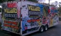
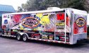
A couple of my first wraps
- Thread starter tintwizz
- Start date

SlightlyChilled
New Member
I hope you got permission from Hana-Barbra before using there art work.
SlightlyChilled
New Member
WOW why did you remove the Flintstones truck you did?
Should I remind you of the TEN COMMANDMENTS thou shall not steal.
Should I remind you of the TEN COMMANDMENTS thou shall not steal.
btropical.com
New Member
fat guys w/ hot chics
HulkSmash
New Member
WOW why did you remove the Flintstones truck you did?
Should I remind you of the TEN COMMANDMENTS thou shall not steal.
He's a faith based business though
SlightlyChilled
New Member
oooo sorry I forgot :Oops:
weaselboogie
New Member
Less is more! Too much clutter!
SlightlyChilled
New Member
Yep all the back round stuff it makes my eyes hurt. I bet it would look real good with out that.
SignManiac
New Member
Understanding color theory along with good color contrast can eliminate the need for excessive outlining. Some outlines can aid in good design, but should not be used as a crutch to make lettering stand out against improper or weak backgrounds.
John Butto
New Member
Cheese&Rice...looks good for first time wraps.