• I want to thank all the members that have upgraded your accounts. I truly appreciate your support of the site monetarily. Supporting the site keeps this site up and running as a lot of work daily goes on behind the scenes. Click to Support Signs101 ...

A Couple Wraps we've done.

HulkSmash

New Member
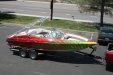
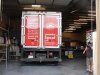
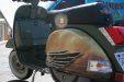
A few wraps our company has done. Thanks everyone for taking the time to look.
 

Attachments

  • Picture 481.jpg
    Picture 481.jpg
    57.9 KB · Views: 159
  • Picture 483.jpg
    Picture 483.jpg
    55.8 KB · Views: 105
  • 45.jpg
    45.jpg
    48.1 KB · Views: 152
  • 4.jpg
    4.jpg
    41.6 KB · Views: 120
  • 71.jpg
    71.jpg
    50.2 KB · Views: 98
  • 1_07.jpg
    1_07.jpg
    29.7 KB · Views: 77
  • 1_02.jpg
    1_02.jpg
    23.4 KB · Views: 98
  • 70.jpg
    70.jpg
    56.9 KB · Views: 106
  • 89.jpg
    89.jpg
    43.3 KB · Views: 185
  • 90.jpg
    90.jpg
    48.6 KB · Views: 100
  • 91.jpg
    91.jpg
    48.9 KB · Views: 161

Flame

New Member
Someone went juice drop crazy. Totally not digging your company vehicle, brings wraps to a whole new level of hideous.

On the other hand, Kart looks tight!

Nice variety, thanks for sharing.
 

HulkSmash

New Member
Someone went juice drop crazy. Totally not digging your company vehicle, brings wraps to a whole new level of hideous.

On the other hand, Kart looks tight!

Nice variety, thanks for sharing.

I agree. Hence the re wrap.
 

Attachments

  • volvo 001.jpg
    volvo 001.jpg
    64.7 KB · Views: 157
  • volvo 002.jpg
    volvo 002.jpg
    71.5 KB · Views: 99

Craig Sjoquist

New Member
Thank you for sharing, some nice work, good design, layout, flow, balance, appealing images, plus your company car is even a bit on the edge, way cool likes them all except bus a little scattered but still good.
 

HulkSmash

New Member
Thank you for sharing, some nice work, good design, layout, flow, balance, appealing images, plus your company car is even a bit on the edge, way cool likes them all except bus a little scattered but still good.

Thanks craig. As for the bus. We didn't design that.. we just did the print/install.
 

Dan Antonelli

New Member
Some nice work. The re-wrap on the shop truck was a good idea, but the lack of branding still bothers me a touch. Looking at it, I wonder if its apparent at a glance what it is you do. Its nice, but I wonder if a different concept would have been more effective.

Colorado Shade and Shutter I think could have been much more effective without any photography, and instead, maybe having the branding much more dominant. Right now, the most dominant lettering that is legible is actually 'Free Estimates' (which from a marketing standpoint, is a relatively worthless copy point) and perhaps the web address. THe logo suffers from some distance legibility issues because the graphic interferes with the main copy and causes visual disharmony as the the letters compete with the graphic.

And there's way too much copy on this, too.

Of course, its easy to critique now - as none of us know what the client said, and/or directed.

Now, compare this with the messaging for your meat company. Simple, easy to digest. Branding is right on the money - as is the core message. Nothing to misunderstand, nothing to get in the way of delivering a powerful message.

Ironically, it probably cost half as much Colorado - yet is a much better piece of advertising value for the client.

The big trailer is pretty nuts, and the thought of that installation gives me hives from back in the day when I used to try and do just regular lettering over rivets on a box truck. I just plain sucked at installs and still have no clue how you guys do that stuff so good!
 

HulkSmash

New Member
Some nice work. The re-wrap on the shop truck was a good idea, but the lack of branding still bothers me a touch. Looking at it, I wonder if its apparent at a glance what it is you do. Its nice, but I wonder if a different concept would have been more effective.

Colorado Shade and Shutter I think could have been much more effective without any photography, and instead, maybe having the branding much more dominant. Right now, the most dominant lettering that is legible is actually 'Free Estimates' (which from a marketing standpoint, is a relatively worthless copy point) and perhaps the web address. THe logo suffers from some distance legibility issues because the graphic interferes with the main copy and causes visual disharmony as the the letters compete with the graphic.

And there's way too much copy on this, too.

Of course, its easy to critique now - as none of us know what the client said, and/or directed.

Now, compare this with the messaging for your meat company. Simple, easy to digest. Branding is right on the money - as is the core message. Nothing to misunderstand, nothing to get in the way of delivering a powerful message.

Ironically, it probably cost half as much Colorado - yet is a much better piece of advertising value for the client.

The big trailer is pretty nuts, and the thought of that installation gives me hives from back in the day when I used to try and do just regular lettering over rivets on a box truck. I just plain sucked at installs and still have no clue how you guys do that stuff so good!

Thanks for the feed back Dan. For the shutters car. He was really set on having a "film strip" of images. So i tried to get creative as possible for the design. He had this design sketched up, i just filled it in.
 

Patrick46

New Member
WOW...nice work!!!

I hate wraps, and if I tried to do those Vespa fenders, I'd have wrinkles and splices all over them!! :banghead:

(I actually have to disagree with Dan about the meat trcuk. Yes, this message is clean & simple...but I see MEAT first. I'd rather see the *name* of the meat company first. That part is too small.)


I LOVE your new & improved shop truck!!!!! Edgy yes......but visually out there.....DEFINATELY!!!! :omg: :thumb:
 

Dan Antonelli

New Member
WOW...nice work!!!

(I actually have to disagree with Dan about the meat trcuk. Yes, this message is clean & simple...but I see MEAT first. I'd rather see the *name* of the meat company first. That part is too small.)

That's more so a branding problem than a layout problem. Yes, the branding needs a little help in that regard as what they do is primary and name of company is secondary. That approach sometimes works depending on the longevity of the current brand, and also predominant name recognition of the business. For newer businesses, we would not advocate such an approach.

I was just saying, for the most part the messaging is much clearer there than it is on the Shutters layout.

On that note, it's too bad they dictated to you what they wanted. I know an awful lot about pinky fractures after going through a few surgeries on it, but I wasn't about to tell the surgeon how to make the incision, or where to try to reattach my flexor tendon.

So sad to see small businesses make mistakes like trying to do their own layouts, when clearly they are not qualified to make such decisions. Work is work I guess, and you take the job and get paid and move on with your life.
 
Top