-
I want to thank all the members that have upgraded your accounts. I truly appreciate your support of the site monetarily. Supporting the site keeps this site up and running as a lot of work daily goes on behind the scenes. Click to Support Signs101 ...
You are using an out of date browser. It may not display this or other websites correctly.
You should upgrade or use an alternative browser.
You should upgrade or use an alternative browser.
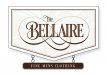
A quick sign design
- Thread starter Borges Lettering
- Start date
SignosaurusRex
Active Member

weaselboogie
New Member
I've been watching this progress. Fantastic as always Charles! Will this font be available?
vinylbarry
New Member
Wow love your fonts.
 Very nice!
Letterbox Mike
New Member
Great work Charles! I've long admired your lettering abilities!
Borges Lettering
New Member
Thanks guys!
@Coloradosigns- It could go both ways. It could be a woman's boutique but I think the colors would have to change to some lavender color.( or pastels)
@Coloradosigns- It could go both ways. It could be a woman's boutique but I think the colors would have to change to some lavender color.( or pastels)
Borges Lettering
New Member

Last edited:
James Burke
Being a grandpa is more fun than working
I also think it could use just a little more testosterone...brush a little here, and spray a little there. I believe Mens should have an apostrophe (Men's).
SignosaurusRex
Active Member
Charles, Is it just me, or should the kerning in BELLAIRE be adjusted with some of the characters? To me, It looks somewhat constricted in some areas that might look better opened up more.
SignManiac
New Member
That LA connection is a tough one. The negative space is so great it almost splits it into two words. The letter form is beautiful, I think it's just the name.
OldPaint
New Member
naaaaaaaaaaaaaaawwww...its just that the L & the A leave a big hole to draw your eye to, really cant be helped.Charles, Is it just me, or should the kerning in BELLAIRE be adjusted with some of the characters? To me, It looks somewhat constricted in some areas that might look better opened up more.