-
I want to thank all the members that have upgraded your accounts. I truly appreciate your support of the site monetarily. Supporting the site keeps this site up and running as a lot of work daily goes on behind the scenes. Click to Support Signs101 ...
You are using an out of date browser. It may not display this or other websites correctly.
You should upgrade or use an alternative browser.
You should upgrade or use an alternative browser.
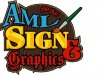
A starting point...
- Thread starter 68dodgeramman
- Start date
68dodgeramman
New Member

John Butto
New Member
fixed it up for ya
OldPaint
New Member
How about now? :Big Laugh
now the GRAPHICS is equally unreadable..because it dont fit the other words!!!!
just a question...how many text modifications(artsy stuff) ...do you really need to make a point????
did you try this design(i like the basic idea)you have in BLACK AND WHITE? seems you got a bag of add on stuff you just dyin to put into a 3 word logo))))) sometimes LESS IS MORE.....
1. the AML IS FINE
2.lose the 3d on the word SIGN
3.REDUCE the ampersand so it sits all alone
4.put the word GRAPHICS in the same text as SIGN only smaller........DO THIS IN WIRE FRAME....then add colors to see how they "detract" or add to readability.
5.NEGATIVE SPACE...ever heard of it....a little here would work well.
Jillbeans
New Member
...first off, do you paint signs? If yes, keep the brush. If no, lose it.
If you're keeping it use a proper lettering brush (just to humor me) nobody else will notice.
Secondly, each element uses a different font.
Dimensional-looking lettering has jumped the shark. Old English jumped it back in about 1875.
•Better font choices
•Less colors
•More contrast
•Lose the busy background
•Either make the flourish bigger or lose it
Think simple, dynamic, good flow.
I'd start from scratch after going to the supermarket and looking at labels, or looking at some old advertising online.
If you insist on using what you have here, make GRAPHICS in the same font as SIGN and move it up onto the same line. And I think SIGN should be plural, unless you are only going to make one.
Love.....Jill
Gino
Premium Subscriber
Wa-a-a-a-y too much going on. Sensory overload in full force.
- Circles are never a good idea. Too symmetrical.
- Too many fonts. Hard to comprehend at a glance.
- Too many harsh colors. Too much tension for the eye creating nervousness about the entire thing.
- Too many gimmicks. Tires the eye.
- No flow/continuity/harmony/uniformity to anything. Nothing relates.
- Too much is closed up with wasted effects. Hard on the eye.
- The word SIGN should be plural.
Marlene
New Member
...first off, do you paint signs? If yes, keep the brush. If no, lose it.
that was my first thougth too. also if I see one more brush on a sign shop sign, I think I'll throw up as it is so over used and almost as bad as beveled letters with 15 outlines and 6 drop shadows. I do like the idea that the logo is set on a sign with some style. the question is do you make those kinds of signs. if yes, then the overall idea works. the fonts are bad choices and the colors are too. if you hand letter and do the kind of style sign in the logo, re-work it so it looks better and go wih it. if no to hand lettering and no to foo foo type signs, then no it doesn't work
68dodgeramman
New Member
Well, it's back to the drawing board! Lol. I'll post a "redo" back here. Thanks
TyrantDesigner
Art! Hot and fresh.
papyrus? really? uugghhhhh gag me with a spoon.
you have 4 different typefaces, with 13 (yes I counted) colors in your design with a asymetrical design on symetrical background and as a whole, something ugly and unreadable.
Couple tips, design in only 2 color to start (black and white, pink and purple, whatever) make that look solid before going through and making it a rainbow mess. I can see where it has potential, but simplify your thoughts .. right now it's a schizophrenic mess and needs less voices, less chaos and more consistancy.