-
I want to thank all the members that have upgraded your accounts. I truly appreciate your support of the site monetarily. Supporting the site keeps this site up and running as a lot of work daily goes on behind the scenes. Click to Support Signs101 ...
You are using an out of date browser. It may not display this or other websites correctly.
You should upgrade or use an alternative browser.
You should upgrade or use an alternative browser.
Advice Please
- Thread starter Avanti
- Start date


Dave Drane
New Member
Look'n good!!
SignManiac
New Member
Very much liking 1st and 2nd. Not so much 3rd one. Would enjoy seeing more of your work. Welcome from FL!
iSign
New Member
agreeing with maniac.
The third is difficult to critique without knowing how much might be subject to change. The color combination doesn't say salon to me, but if that is set already... what about the repetitive striping with the white... is that negotiable? If you need it, I would not use the horizontal one... only vertical.. and would suggest not having quite so many of them. also, I'd consider trying an asymetrical arrangement.. maybe even a progression of fatter lines & spaces, gradually transitioning to thinner ones... and only on one side... maybe just a more basic double strip on the other side... heck, my ideas might not look good either, but I'd be trying something different on that one.
My only other thought was to get into some node editing on the first Italian restaurant layout. If you can get the tails flowing from a preceeding letter to tie in better with the following letter, it would be worth the trouble... maybe on the second "p" I'd cut off that tail, and on the "o" I'd try to steal the tail off an "a" and get it to flow right into that "s". The other thought is in regards to the fade you have in those letters, and the stark transition from "r" to "i"...that makes me want to see it fade, but if you liked the second "p" with no tail, a stark color shift might look better (to me) between two letters that don't touch..
anyway, they all look good, but different tastes bring different suggestions, so it's great when folks ask & we can all see the variety of concepts...
iSign
New Member
i predict and incredible public backlash if the man with a gun (itialian gangster) is ever accepted. some people will be very offended.
...the food is to eat. the gun is too kill people. just doesn't remind me of an evening with my family or date.
good point...
Dave Drane
New Member
I like the design, considering it is themed on the roaring 20's. The pictorial is just fine. I think that political correctness goes too far. If it was my restaurant I would have a model of Al Capone at the front door with a gun in his hand!!
bob
It's better to have two hands than one glove.
Numbers 2 and 3 are rather ordinary, perhaps worthy of a shrug, certainly not a comment.
The first one has some issues.
The one with the machine gun guy is typographically dubious. It features some sort of script with some floating and some not floating characters, never a pleasing effect, and the script 'o' is locked in a struggle with the 'A' in restaurant. Nice try, good idea, amateur implementation.
The black one has color issues. The red dots over the 'i's are confusing and contribute nothing. I thought they were some sort of cat's eyes at first glance. The discordant interruption of the green gradient is unpleasant, it grabs your eye and make you wonder if the name of the place is really two words. The white tag line is adrift all alone done at the bottom. Another nice try.
TheSellOut
New Member
Bob certainly has a way with words...you'll learn that about him! Much like his avatar, I picture him as being just a big, somewhat snobbishly intelligent, knotty haired dog that really just likes belly rubbed once and a while!
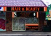
Anywhoo, I like your style and think you have some nice layouts going here! While I agree with some of the comments posted I still really like the gangster with the gun, he almost brings a thrill and sense of excitement to the same old boring Italian restaurant motif. I liked Isigns suggestions and would also try subduing the colors of the gun in that design, as now they draw a lot of attention to it, and maybe change the color of the name (which I love that font) to make it pop a little more. I love the "Silk" layout...very classy...and like the others, am not so crazy about the "Hair and beauty". The colors are very "sports-y" and since the lines have to stay can they maybe have a little movement. I bet if you made them wave a little bit it would do wonders for the layout!!
Thanks for sharing your work and we look forward to more!!
Dave Drane
New Member
You obviously have talent.
I personally like the gangster one... except wondering what you can manipulate to lose the gun? Great concept just not so PC. Once inside - YES but from outside looking in - I would probably bypass the restaurant.
Just sayin'
Cheers - G
Greg, this is Australia. I don't know about Sydney, but it would go over alright in Queensland. This model is exactly what I would have at the front door if it was my restaurant. It would draw attention as it did for me.
Attachments

Probably right Dave - a "Sydney" thing.
Up there you have theme parks etc etc and a much more relaxed attitude, possibly due to a lot of tourists. Yes we have tourists, but we also have a large (sadly) gun crime rate.
Rethinking if it was a totally themed restaurant such as "Cheeseburger in Paradise" I would probably visit for the experience. Queensland shops / restaurants also seem to be larger and more open than Sydney where you can "see in".
Cheers
Avanti
New Member
Thanks Heathsign, I 've only been in the sign industry for 4 years and everydays a new learning curve, I see some great designs on here (including yours) and hope that I will get to that level oneday, and I'm sure Bob knows his stuff") , any comments are welcome and much appreciated.
, any comments are welcome and much appreciated.
Fitch, from what I know he had the photo taken at a place on the Gold Coast (tourist central) that take 1920's style photos you get all dressed up as a gangster, cowboy and even Burlesque girl and then get your photo taken, so i think your theory is right we do have a little more relaxed attitude.
His restuarant is in a hinterland area that attracts tourists because of the shear number of very good restuarants there, kind of like the Hunter Valley, and I guess he chose the theme to try and stand out a bit more.
Dave your like just around the corner so you get what I mean Rofl
, any comments are welcome and much appreciated.Fitch, from what I know he had the photo taken at a place on the Gold Coast (tourist central) that take 1920's style photos you get all dressed up as a gangster, cowboy and even Burlesque girl and then get your photo taken, so i think your theory is right we do have a little more relaxed attitude.
His restuarant is in a hinterland area that attracts tourists because of the shear number of very good restuarants there, kind of like the Hunter Valley, and I guess he chose the theme to try and stand out a bit more.
Dave your like just around the corner so you get what I mean Rofl