• I want to thank all the members that have upgraded your accounts. I truly appreciate your support of the site monetarily. Supporting the site keeps this site up and running as a lot of work daily goes on behind the scenes. Click to Support Signs101 ...

Another layout - Business cards.. (2 really)

785graphics

New Member
Hi again,

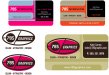
I've been playing around with higher-end business cards and wanted to see what you guys think about these 2: One is for me, and the other for my largest client (I'm currently managing pretty much his entire race program, promotionals, web, etc).. LZ would be printed with highgloss front, matte gloss back with the matte finish text for his site...

785 high gloss only.

buscard1.jpg


buscard785.jpg
 

Marlene

New Member
the two toned 785 graphics is odd looking. the rest is pretty girly looking but it is interesting looking and works for me.
 

JR's

New Member
Hi 785,

I like the motorcycle business card. Looks cool fast and clean.

On your card I like your logo just need something for the 785 logo to flow better between the two colors.
I do not like the half circle or the square rectangles.
But that is just my opinion.

JR :)
 

Rick

Certified Enneadecagon Designer
Rick always has a rabbit up his sleeve....

I have to pull the rabbit out of my sleeve or I get a build up of pellets. I wish the rabbit spelled a little better... I had to make 3 corrections to that post... more coffee!
 

HaroldDesign

New Member
Loose the transparency in the upper left bug of the top one. Yours I just don't care for, but I think it's because it just appears too contrived in trying for balance.
 

785graphics

New Member
Like the first one, with the exception of the "A" in front of only some of the events. Unless it's a class within those events, I would get rid of it altogether (especially in the logo part). And justify the events....to something. The spacing is off.

Wish I could get rid of the A but it;s the class he won..

A = 1000cc .. "A Superstock Champion" is his title..

thanks for the links - those are amazing!

What do you mean by justify the events to something? You mean as in the organization that he won the championships with?

I guess it's difficult to go into it and explain the entire race series and how it works.. basically.. he races WERA, which is club racing - a step below pro.. he won his division (A Superstock) overall - which make him the champion.. Does that make it have more sense on the card?

Thanks everyone!
 

jfiscus

Rap Master
I like th etop one but would change the font on his name, it just looks squished to me, possibly to a bolder condensed font.
 

Rick

Certified Enneadecagon Designer
Here is a super quick idea... not a solution, just an idea.

On the bottom card, design a logo that will work for your needs, then lay it out on a card, you can take it to any level of clean and attractive, but what you have might be missing the mark a bit.

(you can apply spot uv to any design or even add patterns on top too...)
 

Attachments

  • 785 graphics.jpg
    785 graphics.jpg
    168.6 KB · Views: 130

Graphics2u

New Member
Can you use quotation marks on the A to make it look different than the other text? So it doesn't look like a word. Or something to differentiate it from Superbike. just a thought. I like it though. And on the second one maybe a thin black outline or stroke aroung the pink in 785.
 
Top