-
I want to thank all the members that have upgraded your accounts. I truly appreciate your support of the site monetarily. Supporting the site keeps this site up and running as a lot of work daily goes on behind the scenes. Click to Support Signs101 ...
You are using an out of date browser. It may not display this or other websites correctly.
You should upgrade or use an alternative browser.
You should upgrade or use an alternative browser.
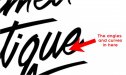
Another Logo with the Ribbon Effect
- Thread starter Joe Diaz
- Start date

HaroldDesign
New Member
You are equally inspiring and sickening.
SignManiac
New Member
Looks classy!

Kottwitz-Graphics
New Member


")
Joe Diaz
New Member
After stepping away from it for awhile and coming back to it, I think I see what you mean. Is this better:(Some of the highlights seem quirky, but it's really hard to argue that when it reads so well on the sign layout.)

That's sometimes the trouble with doing scripts. The one color version is a little clearer though. Regardless I think it will do the job. I can read the thumbnail.Looks nice, a little hard to read.
wayne k
guam usa

Custom_Grafx
New Member
Joe it looks great, only thing I want to point out is the curves on the "e". Might be on purpose, but might not and figured I'd show you in case you wanna touch it up. Here...
It looks intentional. On the coloured version, it is where the ribbon flips?
Last edited:
Joe Diaz
New Member
Joe it looks great, only thing I want to point out is the curves on the "e". Might be on purpose, but might not and figured I'd show you in case you wanna touch it up. Here...
Yeah it was intentional. Ideally I would have loved to have the tail of the "u" flow into the "e" better. However, what I ended up doing was use the same "u" and "e" shapes that appear earlier in the script to keep things consistent.
What also happened was my dad hand lettered a series of different scripts that I used as a reference for this layout. We then picked our favorite, but stole a few elements from other scripts he did that didn't make the cut. The last "e" was different, but I wanted it to match the other "e".
laserman70
New Member
Great work..
would love to see a how to on the ribbon font.
That looks great
would love to see a how to on the ribbon font.
That looks great
Marlene
New Member
that is one nice looking sign. love the ribbon and how you used the shape of the sign with the logo. so many people shove a design onto a background shape with not a whole lot of thought behind it. the ribbon font is cool but the logo/sign shape combo is outstanding and it looks like that shape of sign was designed for that logo and has just been waiting all these years for someone like you to come along and design it.