• I want to thank all the members that have upgraded your accounts. I truly appreciate your support of the site monetarily. Supporting the site keeps this site up and running as a lot of work daily goes on behind the scenes. Click to Support Signs101 ...

Attempt at my logo

J

john1

Guest
Hey guys, I have been doing some reading and wanted to revamp my current logo to make a new ID for myself for 2011.

I think this looks very fun and inviting.

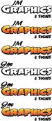
I read that a logo should look good in color and grayscale which is what i am showing in these proofs. Also, as Jill said, highlight one thing and not everything that way your main focus stands out which is what i tried with separating the GRAPHICS with the text of JM which is less important than GRAPHICS.

Another tip i picked up was to separate two colors with a white outline but i think the third design isn't as legible with that for some reason.

I am debating on getting Deaton to cartoon me since this is my company and what better way to represent your company than with your face all over your advertising. This may be a mistake though so let me know your thoughts on that too. I was thinking having my shoulders up on the right top side somewhere.

Your suggestions are helpful as always, Just don't bash me too much, I really couldn't find brush script for some reason to make it POP :toasting:
 

Attachments

  • Untitled.jpg
    Untitled.jpg
    62.4 KB · Views: 97

SignStudent

New Member
Yeah the Jm just doesn't read right to me either. For some reason I see it as Jim. Maybe if both the J and the M were capitalized?
 
J

john1

Guest
Yeah the Jm just doesn't read right to me either. For some reason I see it as Jim. Maybe if both the J and the M were capitalized?

I have always debating on what to do in this case, I get so many people calling me and saying "Hey Jim" it's like, How can i really distinguish it's J-M GRAPHICS not JIM Graphics lol

Check these out, I like the bottom designs better since it's better use of the J that comes down and the m that doesn't.
 

Attachments

  • Untitled4.jpg
    Untitled4.jpg
    56.4 KB · Views: 75

Gino

Premium Subscriber
I'm not a big promoter of punctuation, but perhaps making it look like what it really is will help........... J. M. :rolleyes:
 

fmg

New Member
The more I look at this it doesn't really say logo to me just a couple of fancy fonts.
Can you bring a design into this and develop perhaps a LOGO?
 
J

john1

Guest
Here it is with the . and . added. I think this makes it more clear. Suggestions on the overall look?
 

Attachments

  • Untitled4.jpg
    Untitled4.jpg
    125.2 KB · Views: 71

SignManiac

New Member
It needs something to pull it all together and the JM needs to be clearly legible. Something like this perhaps? Still keeps it light and fun.
 

Attachments

  • JM GRAPHICS.jpg
    JM GRAPHICS.jpg
    131.5 KB · Views: 84

showcase 66

New Member
I was thinking the same as Gino. On all of them, if I stand back from the screen about 5' I still see "jim". "J.M." may be the best way to keep people from calling you Jim. That or just go with it and call yourself Jimmy's Graphics and Signs. Go with a more paradise look and when people walk through the front door, instead of a door ding, have Margaritaville start playing.
 
J

john1

Guest
It needs something to pull it all together and the JM needs to be clearly legible. Something like this perhaps? Still keeps it light and fun.

See i was going to put & signs in a oval similar to that but didn't want to take away from the focus which is GRAPHICS. That looks good though!

I was thinking what i had came up with was a as simple but yet impactful in large size as well as small (business cards, letterheads, invoices etc). Wouldn't making it more complicated have to make you take out things for a simple gray scale look on letterheads, invoices etc maybe?

I'm a home based shop so i don't get walk ins, So i was looking to do something nice looking to brand myself locally with. I appreciate your suggestions!
 

speedmedia

New Member
I would certainly look to go with more of a layout like SignManiac has posted. Yours just looks like plopped out words.

I needs something to tie everything together, has no flow and bad combo of fonts together.

Thanks,
Kurt
 

Rick

Certified Enneadecagon Designer
Do you have anymore ideas?

Looking at your earlier post:
http://www.signs101.com/forums/showthread.php?threadid=74532

It seems your attempts here may not match your aspirations.

This looks like a good opportunity to do many concepts on "fun and inviting" but a warning.. do not limit yourself by your own thinking... yeah, you have to like it, but it may help to think about attracting the clients you want.
 

njsigns

New Member
I was reading your other post about inspiration to make quality designs.

I have been looking through my most recent issue of Sign & Digital Graphics mag and i have found great inspiration to turn around the quality of my work. Lately i have been realizing that, i want to really put out quality designs that truly ads value to my customers instead of just saying it adds value to say it.

I really really love how imagination corporation (Dan), House of Signs, Joe Diaz and Letterhead Fonts put together their designs. Everything from the colors, gradients used, shapes used, fonts used and overall design is just outstanding. I really love the 1800's style of fonts too.

I'm sorry but I'm not getting that feeling from this logo. I'm not suggesting you copy any of the works you mentioned but I certainly think if that's the type of work you'd like to go after you're going to need to present yourself in the same light.

I'm not trying to be rude, so please don't take it that way, I'm just trying to get you to expand your thought pattern on the development of your identity.

Gene
 

sardocs

New Member
Is there a reason Graphics is way bigger than signs? Do you see yourself as a signmaker or a graphic designer first?
 

Attachments

  • jm graphics.jpg
    jm graphics.jpg
    75.1 KB · Views: 74
J

john1

Guest
I was reading your other post about inspiration to make quality designs.


I'm sorry but I'm not getting that feeling from this logo. I'm not suggesting you copy any of the works you mentioned but I certainly think if that's the type of work you'd like to go after you're going to need to present yourself in the same light.

I'm not trying to be rude, so please don't take it that way, I'm just trying to get you to expand your thought pattern on the development of your identity.

Gene

I thought it may come off as not matching but now that i think about it, i really like that style but i just want to overall be able to put good designs together no matter what style.

I like that look above too
 

Craig Sjoquist

New Member
Well likes what SignManiac & Sardocs did ..but still does not give the image of high end advertising at all.
To me it would be a image of window splash like I do would fit better.
If you want high end customers you need to design and layout like this, Dan S logo can look this way because of the theme clients he goes after and his skills match.

John1 your design is good and you see errors and changes needed, which means you must push even harder to find the right image, like I said before read Mike Stevens book and Dan Antonellis books then redesign your logo with this knowledge you will be surprised how well your work will look and sales to follow.
 
Top