• I want to thank all the members that have upgraded your accounts. I truly appreciate your support of the site monetarily. Supporting the site keeps this site up and running as a lot of work daily goes on behind the scenes. Click to Support Signs101 ...

Band logo

Pat Whatley

New Member
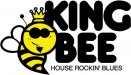
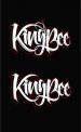
Logo design for a blues band with a rockabilly twist. Trying to do something a little different and hoping to achieve a bit of a retro 50's greaser look without looking like its from a bowling alley, involving a bee, or a crown.
 

Attachments

  • king bee 46.jpg
    king bee 46.jpg
    45.1 KB · Views: 129
  • BEE.jpg
    BEE.jpg
    41.4 KB · Views: 112
Last edited:

Doc Savage

New Member
The connection of the tail on the g in King and the tail on the B in Bee looks like a capital H at first glance. I am not against it I just thought I would give you my first impression when I opened the image. I am liking your overall direction.
 

Jillbeans

New Member
I like it, it has the right feel without looking too tattooey.
There are some stutters in the letters which are either trying to look eroded, but to me look like mistakes (not smooth) they are accentuated when you further detail the piece.
I agree about the pinstripe element looking a bit forced. However, I think a pinstripe is a good thing to add.
So far, I like it, with some tweaking. I love the new rockabilly kids I see when I go to shows (not the poseurs) I think it's interesting.
Love....jill
 

vid

New Member
Nice weight, nice flow, bouncy, it works really well. Get a royalty for the t-shirt printing as I'd think those would fly off the shelf.

As a critique, or more an observation, my eye is drawn to the negative space above the "ee" above the Bee. I'm kind of expecting something there to draw my eye back or balance the exuberance of the K.


(.............perhaps an illustration of a bee. ...with a crown. ...those dotty lines like it's flying around. ...carrying a guitar... some musical notes like it's playing the guitar... and a '56 Chevy Nomad, just cuz I like Nomads.)

LOL
 

Gino

Premium Subscriber
I really like the bottom one without the curlycue thing at the top. Don't think that flourish is needed for anything. It kinda adds confusion for me. Otherwise, that looks great.
 

vid

New Member
Well there was this one....


:rock-n-roll::rock-n-roll::rock-n-roll:


whhhhooooooa, duuuuuuude, you nailed THAT! ...you nailed that with the BIG hammer! You hit that sooooooooooo hard ---

--- i.t .. s.t.i.n.g.s.. a.l.l.. t.h.e..w a y.. t.o..m.y.. h.o.u.s.e!


annnnnnd, the goatee on the bee - BeeeeeeeRILLIANT!


It is pretty cute, buuuuuuuuuuuuuuut, prolly you wouldn't need to concern yourself with a royalty agreement on t-shirts using that particular layout for the hipster crowd.
 
Top