• I want to thank all the members that have upgraded your accounts. I truly appreciate your support of the site monetarily. Supporting the site keeps this site up and running as a lot of work daily goes on behind the scenes. Click to Support Signs101 ...

Big Banner For Shop!

Silvertip

Silvertip Graphics Signs & Designs, Inc.
Hi!
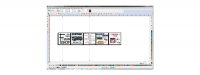
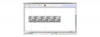
Hope you can see this ok. I was in a bit of a hurry and didn't want to wait for signlab to convert it to a jpeg so I did a screen shot!
Anyway, I have a huge building and we are going to put up a big banner to get the word out that we are here and what we do.
It is by no means finished so please understand I still have work to do on it but I wanted to get some feedback to see what you all think.
The overall size is approx. 4 x 20 Ft. with each box 4 x 4 Ft. The traffic goes by at 30 mph or slower as we are close to a stop sign on a major highway.
I wanted to feature some of the services and things that we do that people just have no idea of! So have at it and let me know what you think lol!
 

Attachments

  • Big Banner.jpg
    Big Banner.jpg
    20 KB · Views: 80

player

New Member
4' x 20' is not very big. Plus now you have chopped it up into 4' x 4' small signs with way too much stuff on it for anyone to actually read anything.

I would keep it to one big, simple message. Folks will come in and ask if they need it.
 

Z SIGNS

New Member
Looks like you are trying to deliver to many messages at one time.

Might be ok for a flier but for a sign that's being viewed by people in cars not good.
Give it the squint test.It looks like one big blur

Remember your design training.
You can only deliver one message effectively.

Hope this helps
 

Sign Works

New Member
Less is MORE Can you read your thumbnail? Can you read mine?
 

Attachments

  • Untitled.jpg
    Untitled.jpg
    19.2 KB · Views: 78
  • Untitled-1 copy.jpg
    Untitled-1 copy.jpg
    70.1 KB · Views: 83

Rick

Certified Enneadecagon Designer
That is a hot mess... keep it simple. Even this
layout will be hard to read at 30mph but it might
get someone's attention.

You might want to add a scale person to your layout,
it will give you an idea how everything scales/proportioned
and see where your layout may have legibility issues...
 

Attachments

  • TIPPY BANNER.jpg
    TIPPY BANNER.jpg
    45 KB · Views: 74

jrsc

New Member
I agree. Way too much info. 4' x 20' isn't that huge. I once did a 5' x 60' in front of our shop and had about 8 words and a logo on it and though it was too much. 2-4 words max and just change it out frequently if you want to deliver more messages. Simple, big, bold text is best for these.
 

Silvertip

Silvertip Graphics Signs & Designs, Inc.
A better explanation

So sorry I didn't quite set the scene right lol! This will be facing the parking lot for my customers. I want to give a visual on some of our other offerings.
We have big letters "Sign shop" on front of building facing the highway traffic.
I figured since I have the long side of it facing the car lot.
Lots of our customers come in and never really even look around the showroom at displays and I thought this would put my building to good use!
 

Rick

Certified Enneadecagon Designer
Does your sign code allow for that?

I believe you are allowed 40 sq. ft. (your banner is 80)
Can only have it up 30 days at a time, 3 times a year.
(probably need to coincide with some event)
Need a temp sign permit.

People have the same attention span outside as inside,
they also like pictures...

... too much copy layed-out haphazardly and you might
not get them in the door.
 

Silvertip

Silvertip Graphics Signs & Designs, Inc.
Sign code

I am ok for codes. I have checked and it is permitted. I agree it is busy and I might have to take it down because I lose but I think it will work for spot. Thanks for weighin in!
 

Billct2

Active Member
Sorry, but that is a big illegible mess, no matter where you put it.
Look at Ricks example and see how he handled the same problem more effectively and legibly.
 

reQ

New Member
Like everyone else said - way to busy. Here is a snapshot of the banner i had printed for snowmobile wraps. size was 48x18 ft and was mounted on side of our building.
attachment.php
 

Attachments

  • bn.jpg
    bn.jpg
    43.1 KB · Views: 117
Here is ours. It's 30' x 9' and we kept it very simple, including only the web address, which should give potential customers all the product and services info they might need.

attachment.php
 

Attachments

  • banner.jpg
    banner.jpg
    407.9 KB · Views: 111

Marlene

New Member
can't see much of anything in that screen shot so can't be of much help. try taking the time to post correctly when asking for help on someting visual
 

Silvertip

Silvertip Graphics Signs & Designs, Inc.
Ok!!1

Like everyone else said - way to busy. Here is a snapshot of the banner i had printed for snowmobile wraps. size was 48x18 ft and was mounted on side of our building.
attachment.php
I will look at it again this weekend and rework! I hear you and acknowledge the "hot mess" lol! I get it truly doooooo!
 

SignManiac

New Member
I designed this banner for my employee for his pinstriping business that he runs on the weekends, although it's a bit wordy. But you must learn to prioritize your copy or else everything will look like you stuck a bunch of letters on a background. A sign isn't just letters.
 

Attachments

  • Dave - Banner.jpg
    Dave - Banner.jpg
    35.4 KB · Views: 74

Stormyj

Just another guy
Lots of fantastic designs. I just like reading all these posts to learn. Thanks to everyone. I try to tell customers, get people to come in and see what you have to offer. Dont clutter with info they wont read or cant read.
 
Top