• I want to thank all the members that have upgraded your accounts. I truly appreciate your support of the site monetarily. Supporting the site keeps this site up and running as a lot of work daily goes on behind the scenes. Click to Support Signs101 ...

Billiards Font Mystery

Bobby H

Arial Sucks.
Usually I am very good at identifying fonts, but I am completely stumped on this one: (image attached; scan of a black and white laser printed page...apologies).

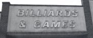
We're going to have to do some refurbishment work on the existing sign shown in the photo, possibly making new letters and a good amount of new neon.

At first glance the type looks like some sort of standard square-ish sans-serif font. But nothing seems to match. I've looked at certain weights of Trade Gothic, Akzidenz Grotesk and a good number of others.

I'm concerned the type may have been significantly customized. That would force us to manually create patterns from the letters, with the best results coming from removing the letters from the building.

I just wish the customer would simply get a new building sign. It's easier to start fresh than have to rework a bunch of stuff.
 

Attachments

  • BilliardsNGames.jpg
    BilliardsNGames.jpg
    45.9 KB · Views: 233

SignosaurusRex

Active Member
Sorry Bobby, I cant tell you for sure. Right off, Makes me think of a funky little thing some guys (myself included on rare occasions) used back in the '70's to make lettering prints to enlarge with a projector. I think it was called a "Kroll lettering template" or something like that. The letters did not match anything exactly. Those are some days that I sure as hell don't miss. I'm afraid your worst fears will be realized as far as having to match-up and refab some new letters. Best of luck!
 

Checkers

New Member
Just thinking out loud here, but what about using a speed press or some sort of frame to hold your pattern paper over the letter and take a rubbing?

Checkers
 

jdb

New Member
What I've done in the past and it worked very well is to vectorize the jpeg.
Adjust your brightness and contrast in editing before you vectorize if needed, but since you probably just need a pattern that most likely would'nt be neccesary. You will have to take another picture on a ladder or something so your directly in front, not at any angle.
 
Last edited:

Craig Sjoquist

New Member
looks like 2 differant fonts used and during the time it was made all of this was done by hand from pattern, metal work then neon fitted ...so ya really can't say anyway ..... how much leway ya have redo using a close correct font with spacing like this would be my guess
freedom is not free
 

stickerguynyc

New Member
font

you could vectorize it. that picture look ok to vectorize. dragg that picture to flexisign and vectorize it or start to type diferent font that fit in it...

some letter look like arial with a little of angle ...
 

Si Allen

New Member
Looks like it predates computers. Thwerefore, not really a font. Craig has the right idea...it came out of someone's head at a drawing board.

Remove the letters from the building...and if any have to be remanufactured, simply place them on a sheet of paper and trace.
 

Bobby H

Arial Sucks.
Yeah, I agree with the approach of making patterns from the existing letters. We've done that sort of thing in the past. I was just hoping there might be some way to avoid that.

What I've done in the past and it worked very well is to vectorize the jpeg.

Unfortunately, the photo suffers from moderate barrel distortion (wide angle lens artifact) and the photo was taken at an angle looking up at the sign. Therefore the photo is useless for vectorizing -especially when the need is there to match existing letters with precision.

Distortion from perspective is also a hazard even when you can take a straight on shot of a subject. Some of that can be defeated by using a long zoom lens and taking a photo of the subject at a distance (to collapse perspective). Still, you never can get rid of the distortion entirely. And some zoom lenses have problems with pin cushion distortion.

Looks like we're going to be sending one of our crane trucks down there to do some work.
 
Top