-
I want to thank all the members that have upgraded your accounts. I truly appreciate your support of the site monetarily. Supporting the site keeps this site up and running as a lot of work daily goes on behind the scenes. Click to Support Signs101 ...
You are using an out of date browser. It may not display this or other websites correctly.
You should upgrade or use an alternative browser.
You should upgrade or use an alternative browser.
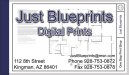
Blueprint Business Card. Critique
- Thread starter showcase 66
- Start date
Jillbeans
New Member
I want it to look blue.
(even if blueprints aren't)
I want to see the name in a roman construction font.
http://new.myfonts.com/fonts/madtype/pacioli/
Love....Jill
(even if blueprints aren't)
I want to see the name in a roman construction font.
http://new.myfonts.com/fonts/madtype/pacioli/
Love....Jill
omgsideburns
New Member
Abosolutely not.
Make the text look like it's the blueprint instead..........................
I like the idea of the end and stuff.
Make the text look like it's the blueprint instead..........................
I like the idea of the end and stuff.
ForgeInc
New Member
Hmm, sorry I think this is way off the mark. I saw the subject and I got excited, cause I have done lots of graphics that were kinda "blueprinty" years ago. This is way too clean, way too stark, way too "desktop publishing".
You have a great opportunity to push the boundaries here. Do a google image search for "blueprints" and see what comes up. Most of them are blue, with simple, monospaced white type, lots of grids, lots of borders, lots of small, all caps type placed in boxes. I would have so much fun with this, I'm jealous... push yourself!
You have a great opportunity to push the boundaries here. Do a google image search for "blueprints" and see what comes up. Most of them are blue, with simple, monospaced white type, lots of grids, lots of borders, lots of small, all caps type placed in boxes. I would have so much fun with this, I'm jealous... push yourself!
I think stylistically, the guys are trying to suggest something like this. The first one is a landing page for the company website while a web developer actually creates the site itself and the second one is the avatar used on forums where the company is a paid vendor.
Attachments


MikePro
Active Member
Really digging those examples.
Thanks guys, those are for my company, which is a really, really odd combination of sign making, custom fabrication, and race-preparation of Subarus.exactly!