• I want to thank all the members that have upgraded your accounts. I truly appreciate your support of the site monetarily. Supporting the site keeps this site up and running as a lot of work daily goes on behind the scenes. Click to Support Signs101 ...

boat license standard

scott pagan

New Member
I have a customer requesting a new design with this typestyle. It looks common (Gerber font?), but I'm not sure.
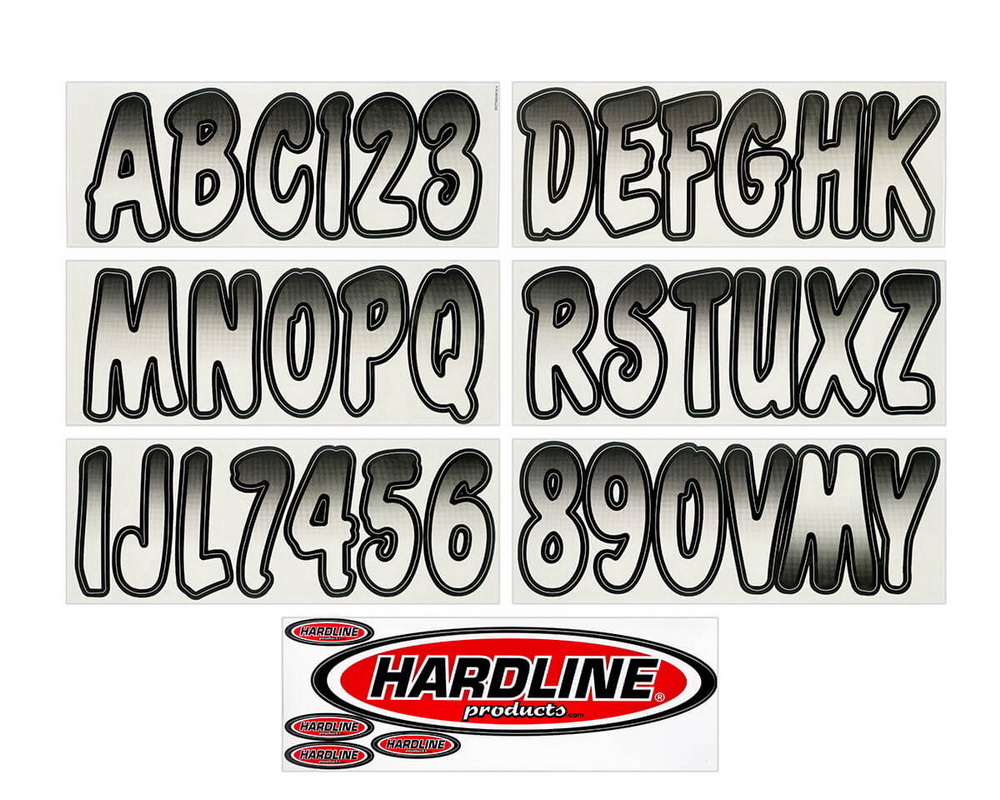
HAD-WHBKG200-17.jpg
 
Last edited:

White Haus

Not a Newbie
Sorry, the font doesn't look familiar to me, but I do love how they just flipped the "M" to make a "W", upside-down gradient and all! :banghead:
 

unclebun

Active Member
Sorry, the font doesn't look familiar to me, but I do love how they just flipped the "M" to make a "W", upside-down gradient and all! :banghead:
That is the W. It's nesting for maximum use of space on the vinyl.

When people ask me to give them this font, I just use a better looking casual brush font and they are happy when I email a proof. If they insist and you do find the actual font, be sure to use uneven latter spacing and get them crooked and out of line so it really looks like they used the Wal-Mart letters.
 

Gino

Premium Subscriber
I highly doubt you can use that font for this customer's needs. The lettering must be in high contrast and with that fade in there, it ain't gonna be.

Obviously, it has nothing to do with aesthetics, so do it right.
 

stamford signs

New Member
these are cheap stick on die cut letters to be put on individually. They’re equal to hardware store mailbox letters
Don’t use this.. create your own
Don’t have your company name associated with that type of work
 
Top