-
I want to thank all the members that have upgraded your accounts. I truly appreciate your support of the site monetarily. Supporting the site keeps this site up and running as a lot of work daily goes on behind the scenes. Click to Support Signs101 ...
You are using an out of date browser. It may not display this or other websites correctly.
You should upgrade or use an alternative browser.
You should upgrade or use an alternative browser.
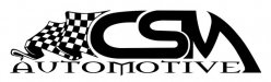
Body Shop Logo
- Thread starter modernmav
- Start date
Craig Sjoquist
New Member
Awesome look, racy, kinda roll cagey, bold image, and fairly well balanced, to help flow better kern automotive a bit to end more with flag end , kinda like a triangle if ya get what I mean or pull it away from M might be better.
Great design refreshing
Great design refreshing

Looks fine ... although I would move the "M" a tad further to the right or decrease the keyline, but I would maintain the distance between the flag and the "C".
Get rid of that nasty nasty "autmotive" font. The other elements are clean and crisp and the "automotive" just messes it up. Keep it plain and this will be a nice classy, racy, easily read logo.
Cheers - G
Get rid of that nasty nasty "autmotive" font. The other elements are clean and crisp and the "automotive" just messes it up. Keep it plain and this will be a nice classy, racy, easily read logo.
Cheers - G
N2Harpz
New Member
I like this one a little better ... more readable..it looks a little "metal" with the faunt. maybe a less is more version will stand the test of time better. you don't want older clientele avoiding the shop because it looks a little too hip for there business.
Tim Aucoin
New Member
I like this one a little better ... more readable..
I agree! At first glance, the "U" read as a "V"... It obviously says AUTOMOTIVE, but it does cause pause when your brain first sees "AVTOMOTIVE". They'd disagree in Rome I'm sure!!

HeavyHitter
New Member
Something to consider when designing a logo to be placed on a race vehicle. The logo you have is some what directional. Consider how the logo will look on both sides of the car. I assume the logo will find it's way onto a car because of the roll cage fabrication mentioned in the OP.
evolutionsigns
New Member
Something to consider when designing a logo to be placed on a race vehicle. The logo you have is some what directional. Consider how the logo will look on both sides of the car. I assume the logo will find it's way onto a car because of the roll cage fabrication mentioned in the OP.
Absolutely right - also, consider the directionality of the waving flag maybe a flag on each side would make the design a little more symmetrical?