• I want to thank all the members that have upgraded your accounts. I truly appreciate your support of the site monetarily. Supporting the site keeps this site up and running as a lot of work daily goes on behind the scenes. Click to Support Signs101 ...

Brain storming for Daycare/School sign...

TheSellOut

New Member
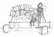
I'm going to propose to my daughter's daycare tomorrow that they update their existing main sign and attached is the first layout I played around with last night. I am going to offer a partial trade out for services, as daycare is expensive, and I would like to get as creative as possible with this to make a really nice portfolio piece!

The sign is double sided and the plan is for it to be completely 3 dimensional.

Would love to hear any ideas!

In the story "Tom Thumb was no bigger than is father's thumb" which has me imagining the creation of a little character to sit on top of the "T" (Tom)
block waving at the kids is they come up to school! My only issue with that is I don't want to make Tom any specific ethnicity but maybe I could make him yellow like a Simpson.
 

Attachments

  • Tom Thumb.jpg
    Tom Thumb.jpg
    82.7 KB · Views: 98

cartar929

New Member
They seem visually interesting, what type of medium are you thinking about building something like this with? Do you have a picture of what the sign looks like now?
 

Marlene

New Member
I like the top version with the offset shapes holding up the end. this would look so cool done dimensional with primary colors. as far as Tom Thumb, you there's so much going on, the name might be enough.
My only issue with that is I don't want to make Tom any specific ethnicity

I can understand your wanting to do this but since it's a story and has been published with images, I wouldn't change too much about him. I looked at images of Tom Thumb and he looks to be kind of a Peter Pan looking, really really small guy. making him yellow might make him kind of creepy looking.
 

Rick

Certified Enneadecagon Designer
I would develop the bottom left a little more, not digging the books, maybe because the tiles may make the sign less legible, the blocks have been done a million times in 2D... maybe thats why I am leaning toward that bottom/left one.

High praise for drawing out your thumbnails, thanks for showing them.
 

signmeup

New Member
I like the bottom left B&W sketch the best. I'm not keen on the blocks. Or the books. Not sure why.
 

vid

New Member
oooooooh geez... gettin' hammered on the books and the blocks and that's what i doodled. :banghead:

Aaaaaaaaaanyway, the bottom 2 were my favorites as well. They tend to fire the imagination a little more. But I'm having a hard time picturing them in place. They seem too vertical or high to me... I don't know what the space looks like though.


For this project the things that I would consider:
  • Making the sign more horizontal - if space allowed.
  • Developing a sense of place for the sign.
    • A place where parents can get all misty-eyed when they drop their child off for the first day of school... and the photo-op to place in the scrapbook.
      A place where the teachers and children can gather for their graduation photo with the sign in the background.
  • Trying to make it interesting, but not inviting.
    • Place flowers around the sign to keep children from climbing on it.
      Buuuuuuut, putting other elements in the space around it that can be investigated. Like blocks, spheres or cones. Those would also work as places to sit for the scrapbook/advertising photo-ops.
  • Really pushing the dimension of the blocks with angles, texture and color
    • --- I know by suggestion of the others, they're on the chopping block. But, I would think about various rotations of whatever element you use to make the sign interesting from all perspectives.
  • Remembering it is still a sign, and not getting to carried away with color.
    • I guess what I mean by that is keeping the base a fairly neutral color so that the sign portion remains the focus of the structure. In my doodle for example, don't paint a rainbow on the arch. Maybe pinstripe it with some color or cut some texture in it, but don't let it overwhelm the sign portion. In that way, the blocks will appear more like they're floating in space.

Anyway, that's my .o2.

Good luck with the proposal!
 

Attachments

  • 101Daycare.jpg
    101Daycare.jpg
    116.9 KB · Views: 83

Brandon708

New Member
The design is pretty cool. First thing that came to mind is that kids are going to want to climb on it and around it.
 
Top