• I want to thank all the members that have upgraded your accounts. I truly appreciate your support of the site monetarily. Supporting the site keeps this site up and running as a lot of work daily goes on behind the scenes. Click to Support Signs101 ...

Bulldog

I was approached by a sound and security company to do some vehicle decals. The companies current "logo" is a bulldog flexing muscles from the Mega Collection clip art books. It's very dated and reflects poorly on this business IMO.

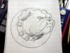
I suggested that he have me create a new updated logo for him and since I've known this guy about 15 years, I'm hoping I can really get him to see how a more professional logo will help his business. The concept is to incorporate the bulldog into the letter O in the name ABSOLUTE. Here is the sketch that I sent him. I really wish I could find that clip art dog to post with it to get some opinions on the current logo as well as the new concept. The clip art logo isn't even anywhere on his website, which to me screams that they need serious help in the branding department.

Please give me your opinions on this design. Even if he doesn't go for it, I will likely still do a vector rendering tonight because the little bugger is growing on me and I can still use it for the portfolio or possibly for a future client.
 

Attachments

  • Bulldog sketch.jpg
    Bulldog sketch.jpg
    43.7 KB · Views: 109
The dog looks good, can you show us what it looks like incorporated into the logo?

I will as soon as I get the dog vectorized. I can pretty much envision exactly how I want the lettering to look in relation to the dog, so I'm gonna skip right past a full sketched mock up and go straight to Corel with this one.
 
Here is where I am with it right now. I just did a colored version of the one with the shield for fun.
 

Attachments

  • Absolute logo 1 low res.jpg
    Absolute logo 1 low res.jpg
    47.7 KB · Views: 90
  • Absolute logo 2 low res.jpg
    Absolute logo 2 low res.jpg
    78.2 KB · Views: 105
  • Absolute logo 3 low res.jpg
    Absolute logo 3 low res.jpg
    101.5 KB · Views: 85
  • Absolute logo 3 color low res.jpg
    Absolute logo 3 color low res.jpg
    166.1 KB · Views: 83
  • Bulldog black and white low res.jpg
    Bulldog black and white low res.jpg
    72.9 KB · Views: 80

thinksigns

SnowFlake
I think you've done a great job. My only concern is that because the dogs collar goes over the name part of the shield, it looks like his head has been stuffed and mounted on a wall.
 
The shield does resemble a mounting plaque, huh? I still have to discuss these with the customer and see what their feelings are on the layouts. From there it may be back to the drawing board. Thanks for the head's up. I also just noticed the collar could use a couple more spikes under the neck. I'm not sure how I managed to overlook that.
 

Gino

Premium Subscriber
Looks pretty good so far.

I'd check on the spacing and kerning of the spikes on the collar. They look a little funky and the highlights and shadowing are a little goofy.

As for all the other bulldogs out there.... there are a lot, so who's to say who copied who's first ??
 

WI

New Member
Your bulldog is tight, looks really good.

When you construct the logo with the head poking through the "O", however, he totally gets lost. I'd ditch that concept. The fonts you're using for "Absolute" and "Sound and Security" are really fighting for attention. I'd step down "Sound and Security" to something simple like maybe a lightweight face in Century Gothic or maybe Gotham if you've got it. I agree with using an ultra-black for the main title of the logo, however you're getting these huge pools of negative space to either side of the sheild, so maybe use something taller? Shoot for the proportions of Impact. Maybe Machine? That one has been done to death, but it does make a statement.

Might also want to try just stacking the bulldog on top of the text. He's strong enough that the shield and the cameo around the business name might just be cluttering things up.
 
Top