-
I want to thank all the members that have upgraded your accounts. I truly appreciate your support of the site monetarily. Supporting the site keeps this site up and running as a lot of work daily goes on behind the scenes. Click to Support Signs101 ...
You are using an out of date browser. It may not display this or other websites correctly.
You should upgrade or use an alternative browser.
You should upgrade or use an alternative browser.
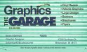
Business Card Design Critique
- Thread starter EbsWeb5150
- Start date
J Hill Designs
New Member
bad contrast (blue on green doesn't work for me)
Pat Whatley
New Member
Is the name of the place "The Graphics Garage" "Graphics The Garage" or just "The Garage"? The name isn't working at all.
Shovelhead
New Member
Graphics The Garage
speedmedia
New Member
If you are going to do "The Graphics Garage" you need to make it read that way. I agree the color contrast is bad as well.
Try doing a search of "garage" images on istockphoto.com or a similar site that may offer some more contrast. I like the name if you get it to read right.
Thanks,
Kurt
Try doing a search of "garage" images on istockphoto.com or a similar site that may offer some more contrast. I like the name if you get it to read right.
Thanks,
Kurt
EbsWeb5150
New Member
thanks for your input back to the drawing board
JoshLoring
New Member
Honestly.. We have one "Garage Graphics" One "Garage Graffix" and a couple Graffix Garage's
How about The Graphics Shack?
How about The Graphics Shack?
Master's Touch
New Member
maybe "Artistic Atrium" (It would get you to the top of the list in the phonebook!)
GraceGraphics
New Member
too busy, too loud, less is sometimes more, too many colors. Just an opinion.
Im not fond of the colors. The layout could use a little work. And on another note...you should look into buying the name web domain for your business. For some reason people seem to be more comfortable with a beberhart@thegraphicsgarage.com rather than comcast, gmail etc. It's just more professional. Just my 2 cents.
richevalenz
New Member
Before you do anything else, go to this website and read and learn. http://justcreativedesign.com/portfolio/
briankb
Premium Subscriber
if you are going to stick with the garage door; make it half way open and dark and put the contact or important information there in white so it is easy to read.
I'm guessing you have a good bit invested in equipment. why not have someone design your logo including a color scheme and letterhead mast. The mast could be used in quickbooks and even you website if your budget is tight. spend a few hundred on a good logo and design. there are quite a few here on the forum that will do a great job for a logo or you can find someone at 99designs.com or similar crowd sourcing sites.
I'm guessing you have a good bit invested in equipment. why not have someone design your logo including a color scheme and letterhead mast. The mast could be used in quickbooks and even you website if your budget is tight. spend a few hundred on a good logo and design. there are quite a few here on the forum that will do a great job for a logo or you can find someone at 99designs.com or similar crowd sourcing sites.
JoshLoring
New Member
Briankb- I'm not sure he I going to pay for logo design when his business card advertises that he offers logo design. =0
briankb
Premium Subscriber
Briankb- I'm not sure he I going to pay for logo design when his business card advertises that he offers logo design. =0
you make a good point and ironically so did I.
Jillbeans
New Member
I would put the laundry list on the back for starters.
And get a website, they are easily affordable and make your business seem more established.
It does read really weird.
The colors could almost work together.
Here's a quickie suggestion which is probably very plain looking.
Using Arial...ugh.
(I do not have any Hellvetica-ish fonts in this program)
Not 100% sure about how I did the back.
Love....Jill
Attachments

JoshLoring
New Member
Sometimes simplicity pays. Jill is already steps ahead from the original. Nice work Jill.
Brainstorm: graphics garage- I think garage sale - garage outline - logo shaped like a roofline - "great deals" - homely colors, welcoming - hmm..
Brainstorm: graphics garage- I think garage sale - garage outline - logo shaped like a roofline - "great deals" - homely colors, welcoming - hmm..
EbsWeb5150
New Member
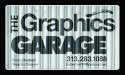
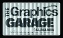
Update on card from advice of -JT Grace Graphics and others on this forum
EbsWeb5150
New Member
JoshLoring
New Member
Using hard lighting and displacement mapping is cool but it's making your lower text illegible.
Your logo looks much better but work on making the card more legible.
Your logo looks much better but work on making the card more legible.