• I want to thank all the members that have upgraded your accounts. I truly appreciate your support of the site monetarily. Supporting the site keeps this site up and running as a lot of work daily goes on behind the scenes. Click to Support Signs101 ...

Camp sign

L Town Graphics

New Member
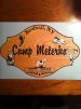
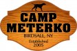
my father asked me to make him a sign/logo for our camp. could I have some input please? whats good about and whats not so good (what you would change). I'm pretty new here but i'm looking to improve my skills and with a group like there are here i'm sure i can take something from this
 

Attachments

  • camp meterko sign.JPG
    camp meterko sign.JPG
    174.7 KB · Views: 116

Pat Whatley

New Member
The gradient at the bottom looks really out of place with everything else being in spot colors. Personally I'd have gone without the images, or just used one well chosen image, so I could put the focus on the name of the camp (which I'd have done larger and in a different font)
 

Gino

Premium Subscriber
  • It never really looks good to arc upper and lower case.
  • I think you should use two lines for the camp name.
  • If you need that many pictures, could you try to have a flow going ??
  • How ‘bout aiming that hunter towards something, so he doesn’t look like he’s shooting the air.
  • The flourishes at the bottom look out of place.
  • Try an inset stripe or a border and a stripe…. that border is too puny for the style.
  • The ‘Established’ part shouldn’t be so dominating.
  • Drop that box, too.
  • Is it going to be real wood or are you going to simulate it ??
 

L Town Graphics

New Member
more room above town name / match curve

The gradient at the bottom looks really out of place with everything else being in spot colors. Personally I'd have gone without the images, or just used one well chosen image, so I could put the focus on the name of the camp (which I'd have done larger and in a different font)

Points well taken, Pat after looking at it again I agree, camp name should be larger. Is there a font you would suggest?
 

Pat Whatley

New Member
Ummm...not to step on your toes or anything but I was playing with it while eating lunch. I wasn't going to post it but since you asked about the font...
 

Attachments

  • camp meterko.jpg
    camp meterko.jpg
    62.8 KB · Views: 95

SignManiac

New Member
The gradient at the bottom looks really out of place with everything else being in spot colors. Personally I'd have gone without the images, or just used one well chosen image, so I could put the focus on the name of the camp (which I'd have done larger and in a different font)

Have to agree, especially regarding the images. Choose one good one and also define your focal point better. Everything is scattered looking right now.
 

John Butto

New Member
mytake

ahh, sitting by the fire with knotty pine walls, dead animals and gun above the fireplace, "hey bungalow bill what did you kill"
 

SignManiac

New Member
How big is this sign going to be? What are you planning on making it out of? How and where are you going to install it? Are you hand painting it, printing it, or carving it?

These are just a few questions I would be asking right up front.
 

L Town Graphics

New Member
ahh, sitting by the fire with knotty pine walls, dead animals and gun above the fireplace, "hey bungalow bill what did you kill"

How big is this sign going to be? What are you planning on making it out of? How and where are you going to install it? Are you hand painting it, printing it, or carving it?

These are just a few questions I would be asking right up front.

Well lets start with correct spelling MeterkO. He wants one as a decal for the back window of his truck and nother one which he hasn't decided where he will put it or on what. The one you see in the pic is 8x12.

BTW i like the drawing... well done
 

HulkSmash

New Member
Well lets start with correct spelling MeterkO. He wants one as a decal for the back window of his truck and nother one which he hasn't decided where he will put it or on what. The one you see in the pic is 8x12.

BTW i like the drawing... well done

The graphic next to your name.. is that your company.."Logo"?
 

SignManiac

New Member
L town, get off to the right start and invest in Dan the Logo Man and Mike Stevens books. Study them hard and you will improve dramatically. Do a search here on those names and you will see how important this is!
 
Top