• I want to thank all the members that have upgraded your accounts. I truly appreciate your support of the site monetarily. Supporting the site keeps this site up and running as a lot of work daily goes on behind the scenes. Click to Support Signs101 ...

Class project critique

stephenj148

New Member
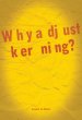
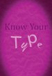
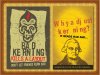
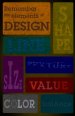
Hi all, looking for some critique on this series of posters I've created for my graphic design class. Some of the things on these posters are done intentionally such as kerning, tracking and using more than one font on a word. I'm looking to improve these in any way that I can.

** I'm an amateur designer (college student) I want so badly to become as talented on the people of this board so please critique at will... I try to have thick skin and take everything with a grain of salt....

Thanks,
Steve
 

Attachments

  • Screen shot 2010-12-15 at 12.04.01 AM.jpg
    Screen shot 2010-12-15 at 12.04.01 AM.jpg
    35.7 KB · Views: 98
  • Screen shot 2010-12-15 at 11.29.18 AM.jpg
    Screen shot 2010-12-15 at 11.29.18 AM.jpg
    31.6 KB · Views: 66
  • Screen shot 2010-12-15 at 12.25.12 PM.jpg
    Screen shot 2010-12-15 at 12.25.12 PM.jpg
    25.9 KB · Views: 59

Rick

Certified Enneadecagon Designer
Was the assignment to make posters about kerning, tracking and type? Or was it to design posters....
How much research went into this?
 

SignManiac

New Member
I don't have a clue what tracking is? Not a graphic artist I guess. If this is a poster assignment, I don't quite understand it.
 

stephenj148

New Member
Was the assignment to make posters about kerning, tracking and type? Or was it to design posters....
How much research went into this?

assignment was to make a poster which could potentially help an incoming graphic design student. Basically what we wished someone told us when we were incoming students.

Probably should have included this. sorry
 

Rick

Certified Enneadecagon Designer
I would try to be more clever... funny, something that will make the person remember it... your posters are not edgy enough....

I few ideas off the top of my head, not that you would use them, but think of a deeper concept:

maybe keep your idea then some image of an angry looking William Caslon with a line below saying "Caslon Would not be happy" or Adrian Fritger saying "You mom told you to watch your kerning?

Another idea it basing the posters on "Type Crimes" (got this from the site, thinking with type)

Or another based on wanted posters with dweeby nerds and what they are wanted for...

I would also try to make the posters look more organic...

I would visit:
http://www.yeehawindustries.com/home.html
http://www.aestheticapparatus.com/
http://theheadsofstate.com/
http://moderndog.com/MD-15/
 

Mosh

New Member
Computer kerning R ULE S!! N Ot! Did you learn about them thar spaces between letters did you> BTW that is what kerning is for all of you "I bought a vinyl cutter cause I got charged too much" people out there, YES YOU RACE CAR F^c&S. I hate Race car diCks that buy a plotter just to do it themselves and show the sign guy they can do it CHEAPER. I have kicked out more theeth that dollars dorks like that have saved. Not saying Racers have many teeth! The last racer that told me he "done got his own sticker cutter" well he ain't been heard for a bit cause he got a maul stick in his craw.
 

stephenj148

New Member
thanks a ton Rick!

I will look these over and try to come up with a better concept.. I struggle with concept and style...
 

Ken

New Member
Boring...

I'm sure you will all find this very exciting. We are starting a new program to help everyone create an individualistic method of delivering new concepts in designing eye-popping graphic design concepts that will really grab the attention of the target market.

Oh, I'm just playing with this..however..from the above blurb..it's not too hard to see how some emphasis, properly placed, can work.
Cheers!
Ken
 

Rick

Certified Enneadecagon Designer
Computer kerning R ULE S!! N Ot! Did you learn about them thar spaces between letters did you> BTW that is what kerning is for all of you "I bought a vinyl cutter cause I got charged too much" people out there, YES YOU RACE CAR F^c&S. I hate Race car diCks that buy a plotter just to do it themselves and show the sign guy they can do it CHEAPER. I have kicked out more theeth that dollars dorks like that have saved. Not saying Racers have many teeth! The last racer that told me he "done got his own sticker cutter" well he ain't been heard for a bit cause he got a maul stick in his craw.

I vote this as the best post of the year... not that is had anything to do with the subject, but because I have a clear picture of Mosh, icing his hand from the punch, downing cheap whiskey while polishing his rifle waiting for a stray squirrel to scurry by...
 

TheSellOut

New Member
something I would tell you, in regards to this assignment as well as to design in general, is that there is more to a design than Type. I say this because each of your posters are all about type.

If you want a A+ on this project then listen to Rick and do your research! For this project, and for yourself as an aspiring designer, maybe do your research on the "Elements of Design" and make a poster for each element. Using an example of that element as the basis for the poster design.

Take this with that grain of salt if you'd like!

Also would love to see your progress on this project!!
 

Ken

New Member
Yes..a follow up on this...

Yes..please provide an update on progress with your project..that would be enlightening to all of us.
Thanks.
Ken
 

Rick

Certified Enneadecagon Designer
Unless you are going to a school teaching computer programs, concept is everything... any monkey can learn software, but you need to research a concept.

What helps me is I try not to be me... if I conceptualized or stylized like me as me, it would not be exciting. Some concepts are obvious, shown in the image is a spin on MADD (Mothers Against drunk drivers) the other was ticking off a type god... even if the concept is lame or childish, your still conceptualizing. Like learning software, you get better.
 

Attachments

  • KERN POSTER.jpg
    KERN POSTER.jpg
    509.6 KB · Views: 60

stephenj148

New Member
Rick, your work amazes me.... I really like what you did with those designs. relatively simple, yet powerful with great design work.

I tried to go with the idea of elements of design and came up with this. I checked out some of the links you posted and tried to come up with a concept for it. Is this working?

I didn't have to stick to the type idea, it was just an idea... I wish I had your ways of conceptualizing because you came up with some great ideas.

May I ask what other steps you take in coming up with a concept. We were taught about mind maps and forced connections... but what else is there....
 

Attachments

  • Screen shot 2010-12-16 at 2.38.59 AM.jpg
    Screen shot 2010-12-16 at 2.38.59 AM.jpg
    45.7 KB · Views: 67

Rick

Certified Enneadecagon Designer
May I ask what other steps you take in coming up with a concept. We were taught about mind maps and forced connections... but what else is there....

Glad you like them... On real jobs, I will do both, but as a habit, I lean toward force connections.

My usual process is... before I have a single thought in my head, I will try to rely on thinking outside myself. I will do whatever that takes, TV, Music, hanging out with the kids, (this can be seconds to days) then try to use imagery I have seen or imagine it, if I read it, and try them out in my head or scratch it out real quick. I use a lot of smart ass humour... If I get a chuckle out of it, or go hmmmm, that usually means I am interested enough to explore it. I rarely explore an idea if I don't get a reaction from myself, it has to move me.

It s very easy right now because I am doing boring work, stuff seems to spew out very fast.

On the visual or style, i have been doing this for a while and can stylize many ways. I also have a lot of resources, (over 1000 books, magazines and scrapbooks I have ripped out of yellow pages and newpapers) and I develop a visual language. I have a bad tendency to lean toward retro... but I keep up with old and new styles.

Looking at the skull poster, I probably should have had blood droplets and I did a little oopsy, it should probably read "Freinds don't let friends kern badly"...
 

Gino

Premium Subscriber
Is that somehow related to 'A picture is worth a 1,000 Words' method of thinking ??

I take it from when I first started doing this stuff, that everyone visualizes everything they read or talk about. In other words, when you say to someone... don't picture this word in your mind, but if you say elephant.... instantly, we picture an elephant.

If you meet someone for the first time, it's easier to remember them because of some feature about them that stands out in your mind's eye and you always picture that with that person, much faster then remembering their name.

We're certainly in a different world when it comes to creating interesting and eye catching ideas, but as in another thread recently...... nothing is new, it just has to be re-invented [outside yourself].... to look new, again.


Rick, that's some awesome advice you're giving the OP. I hope others read this thread just to listen to some very good ideas from where to start when designing or just brainstorming.
 

Rick

Certified Enneadecagon Designer
Looking at your poster reminds me the "elements or language of aesthetics" from this video.

http://www.youtube.com/watch?v=4yOjts0tpco

The poster looks "safe". I am not drawn to it, I'm not feeling it, not loving it, not getting a chuckle or a hmmmm... the big question is.. Are you? And If you did not "love" the idea, why did you go with it?

If you watch the video, you hopefully get the idea that you're gonna have to love it or "feel" the design. Don't impress with the form (your poster needs work).

Impress them with a good idea (or function) you like, the form should follow, if you look around. On the poster, the idea has a wide interpretation, so people with have their own idea of what these elements should look like, and quite a few will not connect with your interpretation. Some people do not connect to my humor, but enough will, to get my point across.
 

Marlene

New Member
the first one you did on kerning made me laugh when I read it as it is set up so that it takes a little bit to get thru it so message doesn't just pop of the page as intended. I liked it. the other two fall in line with the first one so they look like a set of posters. the message is clear in the crowded margin poster but not so much on the one about type. these aren't all that bad as far as concept goes.
 
Top