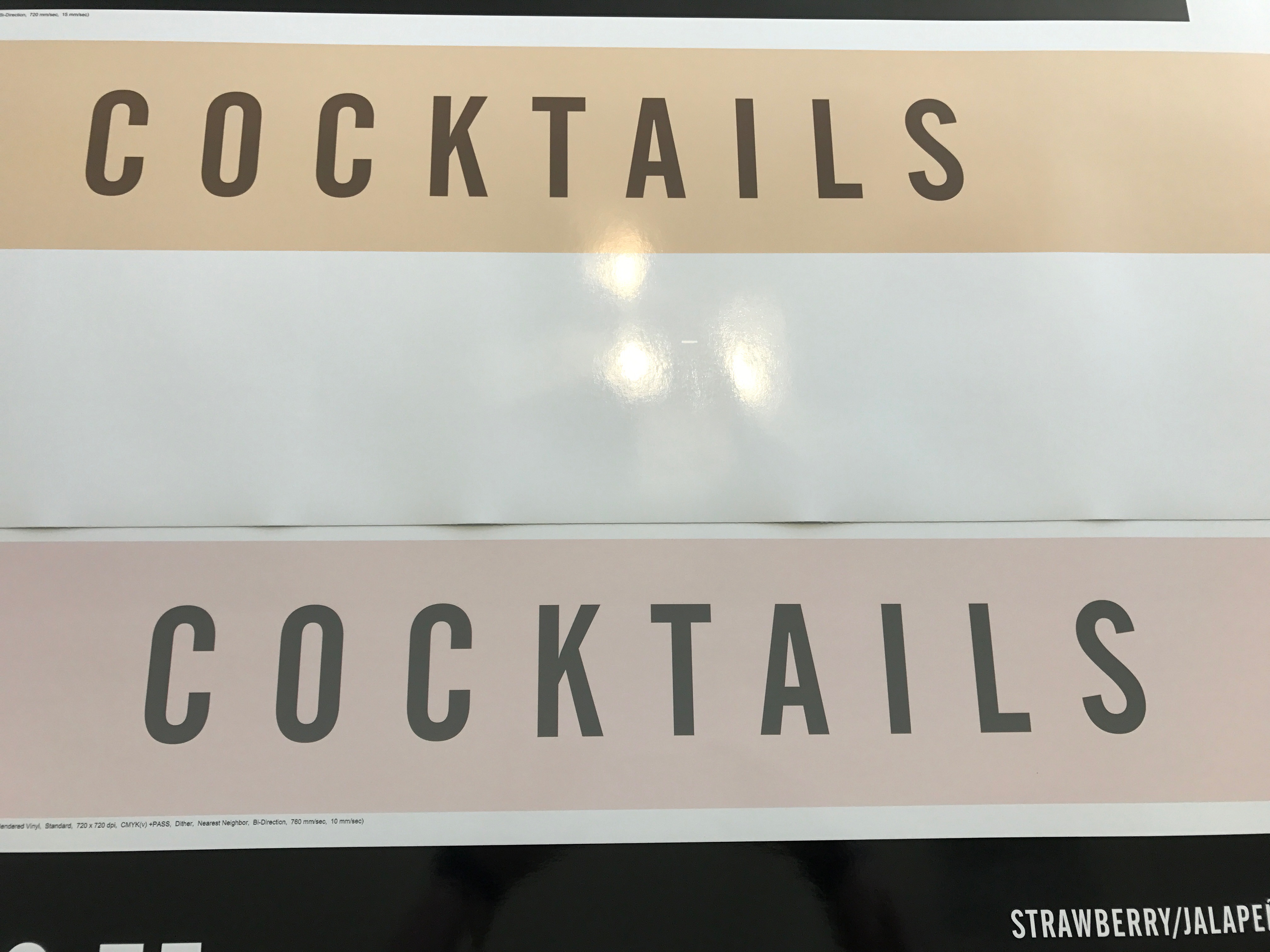
I know the long, involved answer to this is to create custom profiles for each machine. However, currently, I'm looking to just try and get close color between our SP-540v & VP-540. The VP tends to lean heavily towards the magenta. I've attached a picture for reference. Exact same file, same roll of material and using the Roland Glossy Calendared profile for each respective printer. The SP print in on the top and accurate to the screen in Illustrator and the CMYK mix. The VP on the bottom is way off and pink. Running both machines off of the same Versaworks, all settings are consistent in VW and using the same inks for both. Again, I'm not looking for perfection, but it would be nice to not be able to see a difference between the two unless they were right next to each other. These can be opposite ends of the room and you can see it.


