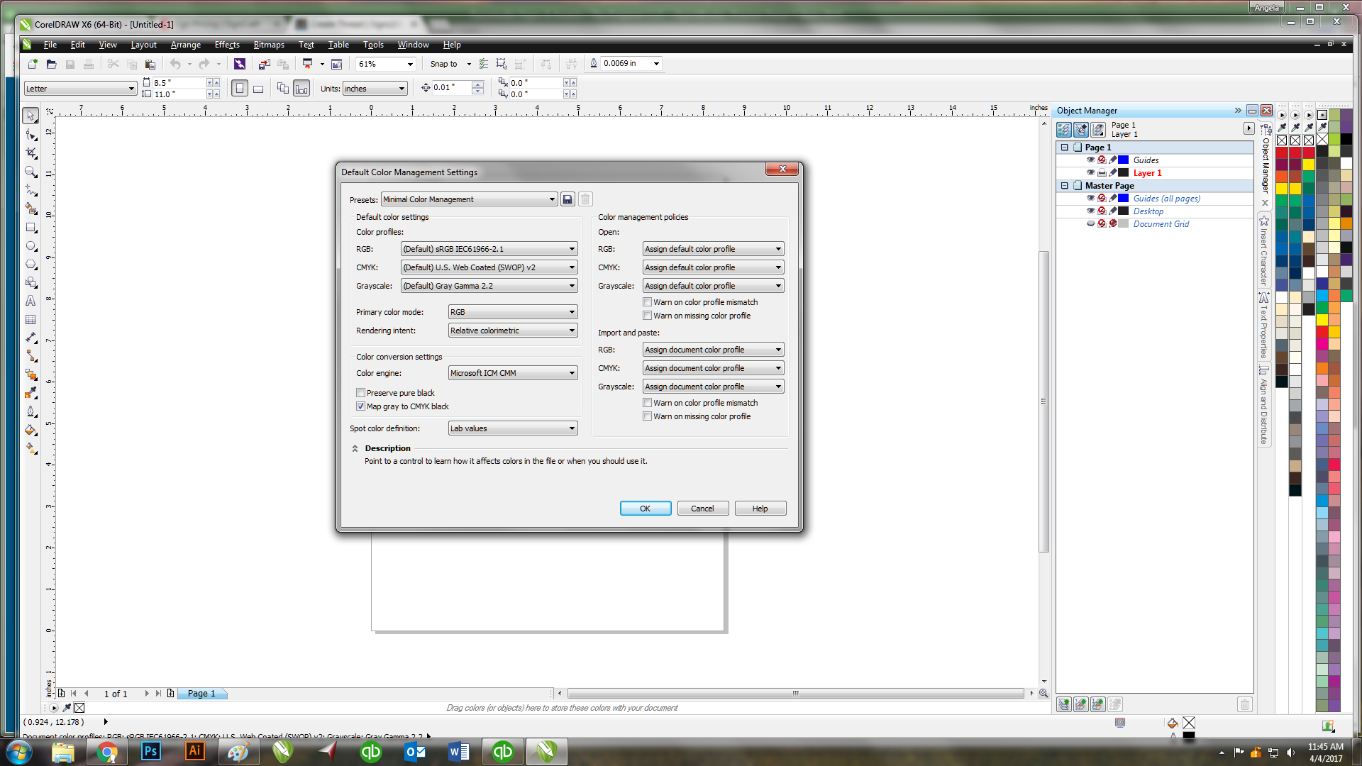
Set the main pull down to "North American prepress" to get started. tweak as needed from there.
pro tip - make ICC output settings permanent and shop wide. on every machine in every app. This is a quality control standard youre setting that should remain once established.
Use adobeRGB (1998) for rgb as its a bigger gamut than the srgb one. Remember RGB is just a monitor color (some cheap printers use RGB drivers, as does windows default
View attachment 129297
print spooler/server, but these arent the kind we use professionally)
I opt to use GRAcoL2006 for cmyk as i export to trade only litho printers and they match my colors spot on thru that. Its close to USwebcoated SWOP but a bit newer. seems to be better in g7 workflows.
Those profiles are available for free at
ICC profiles
Your primary color mode can be rgb or cmyk, rgb has bigger gamut, but since output is eventually cmyk, the bigger gamut will just get compressed downstream when you print.
NOTE: Calibrating your monitor with a colorimeter is crucial at this point. you really cant make any color determinations in a work space without a calibrated system.
For spot color callouts, L*a*b is the best choice as it is the real world reference used by all color tools and profiles. You can measure a color's L*a*b value with a device and match ACAP (as close as possible) in paint, fabrics, print, etc to it. Tools like the $59 colormuse are a great way to do this.
Relative colorimetric should be used for typical signage, perception for photograph only work, and absolute only to output proofing or to multiple machines.
Check all the warnings to be on.


