• I want to thank all the members that have upgraded your accounts. I truly appreciate your support of the site monetarily. Supporting the site keeps this site up and running as a lot of work daily goes on behind the scenes. Click to Support Signs101 ...

Company Truck

Tim Aucoin

New Member
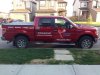
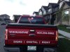
Now that we've re-branded I wanted to take a shot at getting some advertising on my truck. I wanted to keep it clean, crisp and easy for others to read as I roll down the streets. So, go ahead and fire away with the comments. I have big strong shoulders! This was the FIRST TIME I have ever layered vinyl on a vehicle. A huge thank you to Jillbeans for her excellent advice. It was so much easier than I had imagined. The more I work with cut vinyl, the more I love it. It is an art all it's own!
I have yet to put my logo on the hood... I got too busy this week!

I promise not to take any comments/criticism personally. I look at it as a chance to grow and improve, period! :popcorn:
 

Attachments

  • 947000_10151388322121345_1334701162_n.jpg
    947000_10151388322121345_1334701162_n.jpg
    74.5 KB · Views: 174
  • 375068_10151385654831345_879286052_n.jpg
    375068_10151385654831345_879286052_n.jpg
    60.7 KB · Views: 173

Baz

New Member
Nice and simple. Looks good.

Only thing i would do to this is reduce the letter size on the tailgate ... or ... Add the logo on the left hand side of the tailgate, right hand side put the web and phone number together and for the window ... A photo, or photo montage of printing/production/colors/type ... something along those lines printed on perforated vinyl (you'll get enquiries about it i'm sure).

And if it was me i would remove that XTR sticker :covereyes:
 

Gino

Premium Subscriber
Looks great !!

If I were to change anything, it would be to put your phone number underneath your other contact information for only one reason........... I don't like any information that low on any vehicle and the website and facebook stuff would be the next appropriate place to put it.

I agree, remove the XTR
 

Tim Aucoin

New Member
Thanks for the comments and positive feedback!
I really like your suggestions Baz & Gino. I will work on that. I agree Baz... if I do a window perf, it will turn more heads for sure! Just need to come up with a catchy design that won't clash with everything else! :rolleyes:
And okay, okay... I will remove the XTR stickers!! :notworthy:
 

Billct2

Active Member
and debadge the tailgate... otherwise it clean & legible 2 things lacking in a lot of what I see
 

Gino

Premium Subscriber
Hey Tim........... while you're at it, take the one off the tailgate and the dealership's advertisement, unless they're paying you to advertise their name on your truck........ :ROFLMAO:


Something just struck me...... why did you use layered vinyl instead of just printing and cutting a contour ?? It's a white outline from what I can see and the rest of your copy is white, so it's not like you had to match anything. Just wondering...........:rolleyes:
 

rjssigns

Active Member
LOTS of mistakes: no diamond plate, skulls, or flames. Comic Sans or Papyrus weren't used anywhere. And you have a sign shop? :rolleyes:


Just kidding. It is clean and no unneeded BS. :thumb:


Have a safe Memorial Day.
 

Tim Aucoin

New Member
Hey Tim........... while you're at it, take the one off the tailgate and the dealership's advertisement, unless they're paying you to advertise their name on your truck........ :ROFLMAO:


Something just struck me...... why did you use layered vinyl instead of just printing and cutting a contour ?? It's a white outline from what I can see and the rest of your copy is white, so it's not like you had to match anything. Just wondering...........:rolleyes:

I'll look into the tailgate ones too! :rolleyes:
The reason I went with cut vinyl instead of printing is because I didn't like the richness of the blue I was getting on my printer when I tried (exactly what you suggested)! And I have a lot of those two colors of vinyl hanging around from doing my shop windows! In come cases, I find that cut vinyl just "pops" more than printed. Earlier this week I did a recalibration on my printer/RIP, and I think I will get much better blues now. I've always found certain blues tough to match... they tend to lean towards the purple end of the spectrum... :banghead: Plus if I'm being totally honest... I like the smell of cut vinyl :Big Laugh
 

Craig Sjoquist

New Member
Well for what ya have to work with & amount of copy ya did a good job it flows well, & reads well , you will get business with that indeed & there is nothing worth changing at present.


The biggest problem I see is your ..icon & name which are both floating around in space somewhere ...( like the Icon & name etc.).

Some how those 2 need to tie together in the future, like a panel, closer together, lines, something ..This was the 1st thing I saw dead air space between the 2nd & with the phone # close to the ground it really took the eye away which put 5 areas to look at instead of 3... This is minor & since this is new ya did a outstanding job.
 

MtnView

New Member
Looks nice. I have a Jeep Wrangler with a soft top I have been trying to figure out how to finish. By the time I take away the soft top from total advertising area I'm not left with much space.
 
Top