-
I want to thank all the members that have upgraded your accounts. I truly appreciate your support of the site monetarily. Supporting the site keeps this site up and running as a lot of work daily goes on behind the scenes. Click to Support Signs101 ...
You are using an out of date browser. It may not display this or other websites correctly.
You should upgrade or use an alternative browser.
You should upgrade or use an alternative browser.
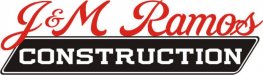
Construction Logo
- Thread starter Marco
- Start date

SignManiac
New Member

ericmitchell29
New Member
I like the J, Looks like a chimney.
The R seems to be messing up the 3d though.
The R seems to be messing up the 3d though.
stephenj148
New Member
the kerning between the R, and A in Ramos could use some adjusting.
Dave Drane
New Member


Dan Antonelli
New Member
Marco-
Way too many elements that will never be discerned at a distance. And you've got 3 typefaces for 3 different words. Think simpler - icon, main copy, subcopy.
Here's some from my other division's web site that deals with contractors which may give you some better insights on structure and format. http://contractor-webdesign.com/logodesignportfolio/index.htm
Work first on building the format, and then the other elements will fall into place easier.
SignManiac
New Member
Marco, you're going backwards. You need to start all over if you ask me, which you didn't. But that last one is crap in the nicest way I can say it.
"Deposit Please"
New Member
When i think construction, i think the color yellow. Not a bright yellow where it will be hard to read, but closer to a mustard yellow. Construction tape, equipment, ladders etc are mostly yellow, it's a safety thing. Try incorporating yellow in the logo. Worth a try


SignManiac
New Member
Just far too many elements as I believe Mr. Dan the logo man has previously stated. Is their name j&m Ramos - construction? Then say that just as it is. Break it down to as few elements as possible.
What you have is not a clear logo, it's a 500 piece puzzle.
What you have is not a clear logo, it's a 500 piece puzzle.
Williams Signs
New Member
Marco
New Member
back to the drawing board... helpppp.
Sign Maniac their business name is J&M Ramos Construction (registered co. name), although they do answer the phone as J&M Construction") hmmm. I am a bit concerned about this logo. I would not like it to look too residential, as in one story home or too commercial with a plain tall building, but I would like to incorporate a structure within the logo. No hammers or any other tool of the trade. They have been around for 20 years, most of the work is subbed out to smaller cos. with the owner of J&M as the general contractor and super. I am at the drawing board again.
hmmm. I am a bit concerned about this logo. I would not like it to look too residential, as in one story home or too commercial with a plain tall building, but I would like to incorporate a structure within the logo. No hammers or any other tool of the trade. They have been around for 20 years, most of the work is subbed out to smaller cos. with the owner of J&M as the general contractor and super. I am at the drawing board again.
Sign Maniac their business name is J&M Ramos Construction (registered co. name), although they do answer the phone as J&M Construction
hmmm. I am a bit concerned about this logo. I would not like it to look too residential, as in one story home or too commercial with a plain tall building, but I would like to incorporate a structure within the logo. No hammers or any other tool of the trade. They have been around for 20 years, most of the work is subbed out to smaller cos. with the owner of J&M as the general contractor and super. I am at the drawing board again.