• I want to thank all the members that have upgraded your accounts. I truly appreciate your support of the site monetarily. Supporting the site keeps this site up and running as a lot of work daily goes on behind the scenes. Click to Support Signs101 ...

Correct Color (Mike Adams) Thank You!

Rev Designs

New Member
Mike,

Just wanted to say thank you for the great work you have done! I also wanted to let everyone know that we are continually impressed each day with the output we are able to achieve now and the colors we are hitting are incredible! We couldn't be happier and look forward the the advancements to our products that is now available because of the profiling and color management workflow we now have in place.

Definitely check out correctcolor.org if you are even remotely interested in advancing your business.

Thanks again Mike!

Matt Jonasson

Rev Designs
 

Attachments

  • File_000 (1).jpg
    File_000 (1).jpg
    124.9 KB · Views: 156

Rev Designs

New Member
Can you explain what they did for you guys?

Process, equipment, RIP, etc.

Thanks!


Yes of Course!

Mike came down and spent 2 days here with us. We are using Roland printers running versaworks. Mike profiled all of the materials he could during his time with us and provided us with amazing colors that we weren't able to hit before. Not only can we hit the colors now, but we can consistently print the same output and confidently know what we are printing without test prints, millions of color swatches, or wasted time wondering the output from screen to finished print. He also provided the best possible speed to print quality ratio that will serve our business perfect. Mike really takes the time to talk and get to know your expectations and provides great knowledge. He doesn't just do the work for you, he explains his work and the theory behind color management.

It is also of great benefit that our output across all of the materials profiled have the exact same color as well as the same color coming out of two separate printers. So whether our customers order custom motocross graphics, or trailer wraps, or banners, or anything else.. the colors across all products will be the same.. not just close enough.

Prior to implementing our color management workflow we were constantly tweaking cmyk values to try and find that "perfect" combination for colors. Then we fought those colors shifting and changed from one media to another. Even on the same media within time the colors would shift due to any little variance. Our best bet was to use the roland color swatch library which is limited at best and frustrating because you aren't going to ask a client to choose roland colors when they specify Pantone colors.

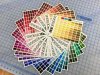
We now have the full Pantone Plus color library printed out for reference and can easily select a desired color and confidently print out the closest mathematically possible color to the actual pantone color that our printers can provide on the desired media. It really feels like moving from grey scale to full color!

Lastly, we also had Mike color profile our monitors. It sounds like a small thing that is easily worked around. However, the advantage of seeing the colors correctly on screen has provided our designs and final output another level of detail and awesomeness that is well worth the extra 20 minutes. Yeah that's right... Mike profiled the monitors in about 20 minutes!

We are now going to invest in a spectrometer after gaining so much knowledge from Mike. We will be using it to create custom spot colors to color match items quickly and efficiently. We definitely can tell that profiling and color management is an art that Mike is well versed in and do not plan on taking on the endeavor alone. Everyone can make a profile, but it takes experience to make a great profile that will serve your business to its fullest.

As for our color management process... Here is before and after:

BEFORE:
Design: CMYK
RIP: Versaworks
Profile: Generic stock profiles
Color match process: Roland color swatches, Custom CMYK builds, Lots of test swatches printed, get desired color then laminate to watch the color shift again...

NOW:
Design: RGB utilizing Pantone colors as often as possible
RIP: Versaworks
Profile: Custom profile per media
Color match process: Pantone color chart / Printed Pantone Chart - print desired color - laminate - deliver to happy customer.
 

player

New Member
Thanks for the information about your session.

Are the extra colours you can hit now still Pantone colours or are they special spot colours he brought into your palette?

What calibration unit are you looking at getting?

Thanks
 

Rev Designs

New Member
Thanks for the information about your session.

Are the extra colours you can hit now still Pantone colours or are they special spot colours he brought into your palette?

What calibration unit are you looking at getting?

Thanks

No problem and the colors we can hit now are still pantone colors. I am looking at getting an i1 to be able to bring in spot colors with specific names for a custom color pallete for specific color matching jobs.
 

player

New Member
Thanks. You have helped me. I just went through a colour issue and had to finally figure out the spot colour feature in VW.
 

splizaat

New Member
Sounds awesome! And if you don't mind me asking, what did he charge you? and which printers are you running that he did the profiling on?

This review really has me sold on it...
 

player

New Member
Thanks. You have helped me. I just went through a colour issue and had to finally figure out the spot colour feature in VW.

Thanks again. I am wondering which Pantone you are referencing? Do you compare it to the actual Pantone spot colour, or process, or solid to process...? I have a Pantone solid to process chart. When I choose P Yellow C solid, it shows on the chart that it should be C:0 M:1 Y:100 K:0, but in Versaworks it shows up in the conversion as
C3.1 M:21.5 Y:85 K 5.5

So I am going to test manually adjusting to C:0 M:1 Y:100 K:0

Any advice?
 

SightLine

║▌║█║▌│║▌║▌█
Happy to hear you took that big step to proper color management! I've tried over the years to praise the benefits of this to others, generally to fall on deaf ears or I get that deer in headlights look on their face. It's not the simplest thing to explain to others.... Of course others that are local to us, well I'd prefer they stay in the dark using canned profiles and keep on producing the lackluster prints they do... :wink:

One thing I've tried to explain to people is that every printer has its own slight differences (even two identical machines side by side configured the exact same will have slight differences) due to different heads and other slight internal machine calibrations and whatnot. Another is that the environment a printer is in with regards to average humidity and temperature also play an even bigger role in how things print. When you keep your head in the sand and just use stock canned profiles you are using a profile that is optimized for some OTHER machine in some OTHER environment and will NEVER get the best results your machine is capable of in your environment.

I invested in an i1 Pro years back when they first came out with that model and its been one of the best investments I have ever made in our business. Another that has been amazing for us has been using all professional NEC PA series monitors which are capable of around 98% of the Adobe RGB gamut. Granted, the monitors are capable and do show us colors that are beyond the capability of our printers but they are also extremely accurate and are not stuck at the sRGB gamut that most all other monitors are only capable of. All of our design work is also done using Pantone Solid Coated in conjunction with RGB, no CMYK. What many do not understand or realize is that CMYK in your design software is NOT the same as the CMYK inks in your printers. Designing in CMYK literally cripples your ability to hit a massive amount of the colors your printer is capable and makes larger files. In the digital print world CMYK files are crippled dinosaurs. There is still some use for CMYK such as for sending out certain files for offset print and whatnot but just not much use for us at all.

While re-profiling media, monitors, etc often can be of great benefit your really have to weigh how often will be important. Yes there will be slight shifts over time but its generally very slight unless you have a pretty drastic change like between winter and summer. I'm also of the opinion that you do not really need to make a custom profile for every single media you use unless you are just doing mostly all indoor close view POP type work and smaller format things. Your custom profiles are still going to be far more accurate, using less ink, and no guessing than any stock profiles. For example we have a base profile (high quality 540x1080 12 pass) for gloss vinyl, and a lower quality base profile which are fine for most glossy vinyl work. However some brands might have a dramatically different white point (when sitting next to another roll one might almost look like more of a cream color) which would benefit from its own profile and there are of course other specialty materials like backlit, matte finish materials, fabrics, etc. that will really need their own profiles. Creating a profile properly does take some learning and time to do each one though. One step many skip is the laminate, they start the profiling process, get their limits, and whatnot set just right, print the swatches to read in and then read them in without laminating the print. There is really so much to consider though that I'm just rambling. Its really a huge benefit to spend some time with an expert like Mike from Correct Color to get things going and to really start to wrap your head around it all. Its not a super cheap lesson, nor will the hardware and software needed but in the long run it is very much worth it. What doing so will add to your company will give your company a BIG advantage over the majority of your local competition. Once you see the differences in print quality and realize that those insane oranges, Coca Cola red, and other colors you have always struggled with or never been able to hit are actually no problem at all, you will understand. Also, yes there are of course still just going to be some colors that are simply beyond the gamut your inks are capable of producing but you will still get a lot closer than you would have before using stock profiles.
 

Rev Designs

New Member
Thanks again. I am wondering which Pantone you are referencing? Do you compare it to the actual Pantone spot colour, or process, or solid to process...? I have a Pantone solid to process chart. When I choose P Yellow C solid, it shows on the chart that it should be C:0 M:1 Y:100 K:0, but in Versaworks it shows up in the conversion as
C3.1 M:21.5 Y:85 K 5.5

So I am going to test manually adjusting to C:0 M:1 Y:100 K:0

Any advice?

So for us a hard color to achieve is Orange. So take for example Pantone 021 c. This is not going to be able to be hit by a cmyk printer.. end of story. However, what happens when you profile your printer correctly is that you are using the absolute limit of its gamut capabilities. Once you are there and your rip is setup correctly it then renders a spot color like 021 c to get as close as possible to the LAB value. For example in versaworks you can use these spot colors and it will show you an approximation of what the colors true output will be as well as a Delta value for the variance the color is off from the actual. So even though we won't be able to hit 021 c we know we are getting the absolute closest we can to it.

In your case with Yellow C. I would guess that the profile you are trying to use and the setup you have within your rip is limiting your gamut. What it is doing then is specifying the CMYK value of what it sees as the closest possible match to Yellow C with your settings and output. This is why correctly profiled media and correct color management settings within your rip are crucial when trying to match and utilize spot colors.
 

guitarguy69

New Member
I re-linearize our fleet four times per year. Does a great job of putting a band aid on the differences in color between the same model of printers concerning changes in the status of the print head due to use and variance. Changes in seasons here also affect the printers color accuracy. It's an easy process and really goes a long way. I will pick our "best" and most freshly tuned up machine to make a master profile, and propagate that profile to all other printers of the same make. By re-linearizing all the individual machines, using the master profile, I can achieve as semblance and balance of color for all the printers, rather than make individual profiles for all the separate machines.
 
Top