Graffy
New Member
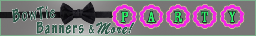
A customer wants a 10 foot wide sign for their craft show booth.
This will be a digital print mounted on white acrylic.
Their name is "BowTie Banners & More". Their only request was to have the word "PARTY", and use some pink in the design.
The scalloped circles represent an element of one of their primary products.
Critiques would be appreciated.
Thanks,
Dan
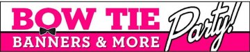
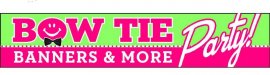
This will be a digital print mounted on white acrylic.
Their name is "BowTie Banners & More". Their only request was to have the word "PARTY", and use some pink in the design.
The scalloped circles represent an element of one of their primary products.
Critiques would be appreciated.
Thanks,
Dan