• I want to thank all the members that have upgraded your accounts. I truly appreciate your support of the site monetarily. Supporting the site keeps this site up and running as a lot of work daily goes on behind the scenes. Click to Support Signs101 ...

Critique My Boat Name

SignManiac

New Member
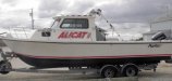
My brothers nickname has been "The Toad" all of his life. He's a certified fish-a-holic. I recently lettered his boat and this is what I came up for him. Have some fun and play with many ideas. Do a quick google search of boat names and check out the endless possibilities.
 

Attachments

  • Toad-boat.jpg
    Toad-boat.jpg
    30.5 KB · Views: 106

Marlene

New Member
the places circled in black are examples of where the letter shapes don't look good together. when you see so much of this in one word with a font, it usually is because the font was not designed to be used all upper case. take a few minutes when you design to really look at the font choice and how it looks with a word.
 

Attachments

  • ALicat%203.jpg
    ALicat%203.jpg
    97.1 KB · Views: 104

signmeup

New Member
I got looking at the cat's tail and thought it looked a bit hook-like.
 

Attachments

  • AliCat22sm.jpg
    AliCat22sm.jpg
    35.2 KB · Views: 96

designali

New Member
Thanks!!

Thanks everyone for the advice, ya'll gave me alot to think about. I need to work on it. THANK YOU AGAIN!
Patty
 

designali

New Member
Final boat sign

Hello all and thanks for all the advice.
This is what I ended up with for the boat name.
The whole cat theme wasn't happening for the guys
so I kept it just simple text.
I also had to stick to the Red Black and white colors.
I think you can see him coming from across the bay now.
Thanks again
Patty
 

Attachments

  • AlicatA.jpg
    AlicatA.jpg
    36.3 KB · Views: 99
  • AlicatB.jpg
    AlicatB.jpg
    71.7 KB · Views: 103

Colin

New Member
That's not too terrible. (Although gray for the shadow would have been better).

"Signs that Float"
 

MikeSTK

Dawns Vinyl Designs
As much as the "Thanks Dad" is difficult to incorporate I personally like the concept.

As far as the owner isn't selling something but relaying a message I would prefer to see it stuck in somehow even at the cost of disrupting the graphic to a degree.

It's a personal object so personalize it. Only the basic rules apply with this application.
 

Pinfinity

New Member
SM has the right idea. The font choice and balance of your graphic looks too rigid. The name should reflect the font choice. What do you visualize when saying "Alicat" take it from there.
 

Pinfinity

New Member
Maybe something like this?

Just having a little fun with it....stole the icon off google and worked it in[
 

Attachments

  • alicatsigns101.jpg
    alicatsigns101.jpg
    25.4 KB · Views: 78
Top