• I want to thank all the members that have upgraded your accounts. I truly appreciate your support of the site monetarily. Supporting the site keeps this site up and running as a lot of work daily goes on behind the scenes. Click to Support Signs101 ...

Critique Requested

JTBoh

I sell signage and signage accessories.
Got another one in the works -
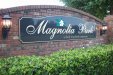
A little background - this is going on a grey prefab concrete wall - it's long, boring, and grey.

I figured some organic/flowing shapes will help break up this monstrosity.

Hoping for pushthrough acrylic, illuminated cabinet, custom masking.

This is super early in the process, so definitely time to improve/alter as needed - just trying to get another few sets of eyes on it.

Edit - 12' long, ~16" letters.
 

Attachments

  • Magnolia.JPG
    Magnolia.JPG
    89.1 KB · Views: 399
Last edited:

Texas_Signmaker

Very Active Signmaker
Looks funky (in a good way). Its cool, I'm just not feelin the lines under some of the letters...font is already kinda hard on the eyes and those random lines add to it.
 

Gino

Premium Subscriber
I'd open the P & R a little more. If that's gonna be backlit, that will be hard to decipher.
 

shoresigns

New Member
Too many underlined letters. Just do one, if any. A quirky feature like that should be used sparingly if you want it to be effective.

The background doesn't work with the text at all. It looks like they were designed separately. Design them so they fit together better.

What were you thinking with the small font on the bottom? It looks like a humanist sans from the 70s-90s, while the main text is done in an Art Nouveau style. You literally put zero effort into the secondary type selection.

I don't know what a "deed restricted community" is, but compound adjectives before a noun should usually be hyphenated, as in "deed-restricted community".
 

JTBoh

I sell signage and signage accessories.
Updated a bit.

I'm gonna try and keep the background stripes. But I did make a few changes, to the font and where the stripes fall.
 

Attachments

  • Magnolia2.JPG
    Magnolia2.JPG
    49.4 KB · Views: 336

WhiskeyDreamer

Professional Snow Ninja
Are the colors set in stone? Also, is there a significance to the background waves? Because they seem kinda random. Is there something local that you can pull from instead? Like is there a specific type of tree or plant that is in the development? Something that the area is known for that you'd be able to incorporate instead?

I agree that the small text at the bottom is a bit of an eyesore. I'd change the font up to match the style in the main text. Not the same font, but something with a similar feel. Also, use upper and lower case letters there. It reads easier and you don't need to "yell" that it's a deed restricted community. On that note, would it sound better to say it's an HOA instead? because "restricted" has a negative connotation to it.
 

JTBoh

I sell signage and signage accessories.
Colors aren't set in stone, just two relatively complementary that will contrast well with a light grey wall. I've played with a few options as well.

I know this is hard to believe, but Clermont actually has "hills" - that was the look I was going for. They'll "get it".

"Deed Restricted Community" is just something that the HOAs around here like to brag about, makes them feel important. Has to be on the sign.
I spent zero time on picking that font, you're right. That is fortunately easily fixed.
 

Gino

Premium Subscriber
I like it. But it doesn't matter what I think. Also, I didn't notice the first time around, but the 'o' looks like you should beef it up to match the other letters,even if it is lower case.
 

neato

New Member
I like it too! I think it would especially look good with the background colors maybe slightly closer in value and some nice dimensional standoff letters. I think the standoff letters would negate the need to make the background flow more with the letters as some have suggested.

Maybe some metallic/rust effects on the background.

This has potential to turn out great.
 

Texas_Signmaker

Very Active Signmaker
I like it too! I think it would especially look good with the background colors maybe slightly closer in value and some nice dimensional standoff letters. I think the standoff letters would negate the need to make the background flow more with the letters as some have suggested.

Maybe some metallic/rust effects on the background.

This has potential to turn out great.

I agree.

Instead of two different colors on the background, do the second color as a shade lighter of the first one
 

JTBoh

I sell signage and signage accessories.
I like it. But it doesn't matter what I think. Also, I didn't notice the first time around, but the 'o' looks like you should beef it up to match the other letters,even if it is lower case.

Yea, that was on the list lol.
Alt. color option attached.
Thinned out one of the lines.
 

Attachments

  • Magnolia3.JPG
    Magnolia3.JPG
    73.1 KB · Views: 323

JTBoh

I sell signage and signage accessories.
Well, I think I'm happy enough to send it to the customer. Thanks for all the advice/tips. Now we wait for a committee of 60 60 year olds to shoot it down, lol.
 

Attachments

  • Magnolia Final.JPG
    Magnolia Final.JPG
    63.4 KB · Views: 314

JTBoh

I sell signage and signage accessories.
My take.. without hills on a gray brick wall for #60 sixty year olds.

Thanks Johnny -
But this is what they currently have. They were looking for a modern update.

BTW I researched it last night - the deed restricted isnt 55+ after all.
 

Attachments

  • Home.jpg
    Home.jpg
    1.6 MB · Views: 882
Top