• I want to thank all the members that have upgraded your accounts. I truly appreciate your support of the site monetarily. Supporting the site keeps this site up and running as a lot of work daily goes on behind the scenes. Click to Support Signs101 ...

Cut Letters look crooked on Van Contour HELP

deadline

New Member
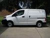
Here is a picture of the van. I'm using cut vinyl on the back indented part of the van, but when we install it the letters look crooked because the lines in the van are curved. Does anyone have any suggestions on how to make it look straight despite the curvature?

Thanks in advance
 

Attachments

  • IMG_1409.jpg
    IMG_1409.jpg
    61 KB · Views: 196

Jester1167

Premium Subscriber
Typically I will pick the strongest horizontal line closest to the text. The bottom of the indention looks to be level with the bottom of the doors.

ALIGN.jpg
 

visual800

Active Member
When in doubt always use bottom of vehicle. On this one the bottom line and the line 2nd from bottom across empty panel is straight. What the hell is that anyway talk about hard to letter damn
 

letterman7

New Member
Measure a line from the ground to use as a reference point.

Rookie. How do you know the van is sitting level to the ground? Use what jester suggested; I tend to use the rocker panels as that is the level "line" on 99% of the vehicles out there.
 

heyskull

New Member
That van isn't too bad to letter.
We don't get that vehicle in the UK but it doesn't look as bad as some.

Try lettering the New Ford Transit Custom!!!!
I have never come across a van that was so awful to put two straight lines on.
What was Ford thinking?
It is as if the only way to sign the vehicle is to completely wrap the van with different shapes to take the eye of the original shape!

SC
 

letterman7

New Member
Try lettering the New Ford Transit Custom!!!!
I have never come across a van that was so awful to put two straight lines on.
What was Ford thinking?
SC

That there is an ugly van. Aerodynamics... pah! Basics still apply - the rocker is the straight line on that van. Everything you put on it would look crooked as heck, though!
 

TammieH

New Member
Typically I will pick the strongest horizontal line closest to the text. The bottom of the indention looks to be level with the bottom of the doors.

View attachment 96201

+1

Then if a customer asks why or complains you can show them by measuring,

Nothing looks worse than when someone aligns to the roof or sloping top beauty line or window, you see cabbies do it all the time, I assume they apply their own graphics.
 

J Hill Designs

New Member
make sure to lay it out in such a way that when the door is open, something like this happens :thumb:
 

Attachments

  • 65856_466938048284_3639386_n.jpg
    65856_466938048284_3639386_n.jpg
    45.1 KB · Views: 162

Baz

New Member
It still looks crooked. I would use that line as reference only then tilt the graphics up a little more on the front end.

Eyeball !
 

Gino

Premium Subscriber
Just tell them to return the van. Tell them they bought a crooked van and need to find a straight one.... otherwise, the lettering is always gonna look outta whack.

You need to speak up before taking the job and explain that something is gonna be crooked, it's the nature of the beast they bought. If not, no explaining after the stuff is on is gonna make you look credible. You hafta know this stuff before going into the job.
 

Mosh

New Member
I see so many van that the lettering is not level, I am sure they are measured from the top! Big mistake!
 

Billct2

Active Member
I use Jesters technique, but if worried show the client exactly how it will look and have tme sign off
 

SignManiac

New Member
To this day I'm still surprised that the manufactures don't take into account that the majority of vans they sell are for commercial use and will most likely be lettered. How can they be so stupid?
 

k.a.s.

New Member
I just did one of these, the bottom line is fairly straight. I used that and then made sure it looked straight from there.


Kevin
 
Top