-
I want to thank all the members that have upgraded your accounts. I truly appreciate your support of the site monetarily. Supporting the site keeps this site up and running as a lot of work daily goes on behind the scenes. Click to Support Signs101 ...
You are using an out of date browser. It may not display this or other websites correctly.
You should upgrade or use an alternative browser.
You should upgrade or use an alternative browser.
Dan inspired wrap
- Thread starter Wraps ink
- Start date
ForgeInc
New Member
with customers lined up in a usual slow time of year you guys dont hurt my feelings...Im sure every job you guys do is spot on perfect right?. we have all had some things we wish a customer would do or not do but they pay my bills so I have to print what they approve. when they sit down in the office with you and show you what they want you try your best to make it look decent. I guess we cant always be 100% all the time and i'm sure some of you have been in the same boat at least once. so the ones who have criticism thanks, and for those who make dumb jokes learn to be professional.
Glad you have it all figured out. If you don't get the "atta boy" you expect and will take feedback personally, I would suggest not posting for potential criticism ESPECIALLY when trying to compare yourself to one of the best designers that frequents this board.
Gino
Premium Subscriber
with customers lined up in a usual slow time of year you guys dont hurt my feelings...Im sure every job you guys do is spot on perfect right?. we have all had some things we wish a customer would do or not do but they pay my bills so I have to print what they approve. when they sit down in the office with you and show you what they want you try your best to make it look decent. I guess we cant always be 100% all the time and i'm sure some of you have been in the same boat at least once. so the ones who have criticism thanks, and for those who make dumb jokes learn to be professional.
Okay, all kidding aside, I think you have your priorities a little mixed up.
It's one thing when a customer brings you bad art or ideas and you can't do a thing to change their mind, but it's YOUR fault if you give them bad art from which to choose to start.
You're preliminaries are not on any level near Dans' nor his company. However, you're 100% correct, you gotta do what you gotta do to keep the doors open and put food on the table, but you're gonna barely be eating TV dinners with stuff like that. If your customer thinks they're all good and is picking from one of those three, you either don't have much competition or none. The first two are wa-a-ay too hard on the eyes. You have sensory overload going on there. The last one is just too bright and takes your eye away from anything important, because of it's potent pigment factor.
Not everything needs to be seen at a first glance. You need to prioritize copy, logos and graphics with subtleties and color combinations. One main ingredient needs to be seen from 1/2 a block away, while everything else becomes secondary or less.
johnnysigns
New Member
I'd wager Dan would be flattered by the OP's initiative, but not by all the negativity you guys keep spewing out all across this post and many others on this forum. There's a few of you guys that make this site not worth checking out anymore.
tsgstl
New Member
I'd wager Dan would be flattered by the OP's initiative, but not by all the negativity you guys keep spewing out all across this post and many others on this forum. There's a few of you guys that make this site not worth checking out anymore.
Agreed
The top one without the lime green really isn't all that bad. Dan's attitude equals his design skills
HDvinyl
Trump 2020
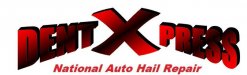
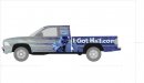
All I see is |GotHai|.com, maybe something like this?this was my least favorite but they seemed to like it and paid a deposit so hey I'm not gonna complain.
Attachments
SlightlyChilled
New Member
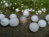
get a pic of frosty pooing hail


IGD
New Member
thats what im saying, alot of shi* talkers on this forum, I just laugh at em lolI'd wager Dan would be flattered by the OP's initiative, but not by all the negativity you guys keep spewing out all across this post and many others on this forum. There's a few of you guys that make this site not worth checking out anymore.
SlightlyChilled
New Member
IGD
New Member
maybe instead of laughing you should listen. if you read between the lines, the outcome is typically the reason why you and or anyone post here to begin with.
if you want the keys to the kingdom you have to make sure your worthy.[/Q
to each thier own, thats the dumbest thing ive ever seen someone post on this forum, lol get over yourself
Last edited:
JoshLoring
New Member
Did I read the title wrong?
SlightlyChilled
New Member
Come on Josh Bad Mr.Frosty is PIMP
David Wright
New Member
maybe instead of laughing you should listen. if you read between the lines, the outcome is typically the reason why you and or anyone post here to begin with.
if you want the keys to the kingdom you have to make sure your worthy.
Are you one of the gate keepers to this kingdom?
Man, you people got to get over yourselves.
The OP committed blasphemy by even mentioning one of the sign gods in a comparative manner to himself.
HulkSmash
New Member
Are you one of the gate keepers to this kingdom?
Man, you people got to get over yourselves.
The OP committed blasphemy by even mentioning one of the sign gods in a comparative manner to himself.
There has been no sign god mentioned...
Dan Antonelli
New Member
+1 on the needing a logo. You can't successfully design a wrap if the client does not have a logo. Sell on the logo then work on the wrap.
This is ultimately a primary reason why most wraps fail.
I'm spoiled because out of the last 50 wrap designs, there was only one we did for a client whose brand we didn't first design - and it was only because he had something decent to work with. Great brands make great wraps; poor ones make poor (or limited effective) wraps. But sometimes you have to take what they give you. We're busy enough that I just turn down work which I believe will be a waste of that potential clients money. They either respect that or think I'm an idiot (the jury's still out haha).
I appreciate and am flattered that our work has inspired you.
 Always cool to hear that, as I've been inspired by so many amazing artists and masters before me, and to this day still inspire. Our last bunch of designs has had some halftones; sort of the flavor of the month. The key is to not get too much into a rut, and constantly think about looking outside the box. But clearly certainly some formulas work on vehicles, and you also have to be just as careful to not change a working formula simply because you've executed a similar construct before.
Regarding yours, my main challenge is I don't get what they do. At first, I thought the name of the company was Auto Hail Repair. Which I thought was odd, because I initially thought Hail was their last name. So I was thinking it should be Hail Auto Repair. So when I wee the huge URL 'IGotHail' I'm thinking that references a proper name, not the stuff that falls out of the sky. Frankly, the whole business concept seems bizarre to me, but maybe where I'm from hail damage is not too common.
So this one is a tough one for me to figure out. Somehow I think 'Hail Damage?' should be in there some how. But honestly, I really don't know where to go on this because the naming seems so weird to me.
I might approach it more with a logo that showed a car being crushed by a large hail (sort of like a cool illustration John Deaton would do), so graphically I can discern the nature of the business. In this instance, their name confuses me and I don't 'get it' yet. But maybe a toon, or character based mascot might help carry the message. Even the URL seems weird though -- I dont have hail. I need the hail fixed. The hail is gone. I actualled got 'hailed' . I dunno. Probably overthinking.
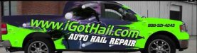
The second post with the green and dk blue and lightning seems really hard to discern much of what the graphics are supposed to represent. Why green?
WHat might be cool is a very simple message but photoshop in some obvious 'dents' in the 'paint'. Now I can see the car is all damaged. Oh yeah - hail. I get it.
Is the name of the company actually a dot com? That's what might be missing - who or where is this company located?
Sorry - I hope I'm not being too critical. Just thinking out loud and tossing out some ideas. Good luck with this one - this one ain't easy. You're first post was better than what they chose. Oh well!
Let me first say I never claimed to compare myself to any other designer. I just stated that his style inspired me to do a (similar) type wrap using old school bursts, fonts and shading.
The name of the company is the dot com. that's why its huge when I spoke to the client about the design before laying anything out they said this is our website and our name.
2. they said we want it HUGE and lime green then said auto hail repair is what we do but we want the website to stand out way more.
3. they said we don't have a logo but this is the font we like and we want a portion of the vehicle to look like it had been damaged by hail, ie. the hood which I didnt post.
so thats what we had to go from when starting the design. one of my designers layed out the one with lightning first going from what I told him. I hated it and begin to show him Dan's style because I wanted to de-clutter the wrap and it would be a new style for us. ususally I get a vision right away when talking to a client but was lost on this one.
they didnt want a logo and wanted blue lime green and maybe red...so thats what can about.
Dan, I respect your response alot and it was spoken like a professional and what I was hoping to get in the beginning. So thanks for your input, my company prides itself on good design and (READABLE) wraps. hope this wasnt too long just had to explain a little
HDvinyl
Trump 2020
Do you do research on your customers?The name of the company is the dot com. that's why its huge