• I want to thank all the members that have upgraded your accounts. I truly appreciate your support of the site monetarily. Supporting the site keeps this site up and running as a lot of work daily goes on behind the scenes. Click to Support Signs101 ...

Design Help

washingtonsignguy

New Member
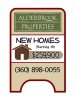
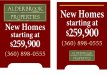
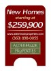
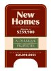
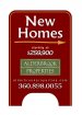
Hey everyone, I need help on a current project. They need a few sandwich boards, like the ones in my design so far. Their logo is already designed, so cannot mess with that. All the information is there and their colors, i just cannot seem to get happy with it. they build higher end homes and want their signs to show that. For some reason i always have troubles designing these A-Boards. Any suggestions?
 

Attachments

  • AlderbrookSandwich.jpg
    AlderbrookSandwich.jpg
    53.2 KB · Views: 153

Pat Whatley

New Member
I think you've got too many competing panels there. It's making it confusing. Also, I'd think the selling price would be more important than the company name but I'm sure they're going to disagree.
 

Attachments

  • AlderbrookSandwich2.jpg
    AlderbrookSandwich2.jpg
    65.8 KB · Views: 123

saktrnch

New Member
Instead of the comic new homes look, how about Exclusive Homes. If there needs to be a house, drop the clip art and put a picture of one of their show houses. And I think if you put a starting price on the sign you are really trying to attract people on a certain budget, usually not people for upper end houses. And their website is probably more important than a phone number so it should be on the sign. I would rather go somewhere and see what they have done before I called them.
 

washingtonsignguy

New Member
Thanks for the suggestions. I would like to see a picture of their homes on there, I design well around pictures, however, they are contractors, and like many these days, they are trying to save money. I like your design ideas Pat, I had the entire sign burgandy initially. I guess it goes back to sticking with your first thoughts.
 

washingtonsignguy

New Member
Here is what i got now. I basically went off your design Pat. I like the idea of the logo on the bottom, as it is not the main message. I also added the website like suggested.
 

Attachments

  • AlderbrookSandwich2.jpg
    AlderbrookSandwich2.jpg
    52.1 KB · Views: 155

rjpjr

New Member
Washington...

Looking at the thumbnail of your last attachment, the boldest and most easily read item was the price. IMHO, "New Homes" should be the most legible message. Perhaps reconsider the message priority of the sign.
 

Attachments

  • Alderbrook-Sandwich-Sign-04.04.10.jpg
    Alderbrook-Sandwich-Sign-04.04.10.jpg
    46.8 KB · Views: 161

watchdaride

New Member
Washington...

Looking at the thumbnail of your last attachment, the boldest and most easily read item was the price. IMHO, "New Homes" should be the most legible message. Perhaps reconsider the message priority of the sign.


this one looks good . :rock-n-roll:
 

Jim Doggett

New Member
Hi RJ,

I think the salient point is not merely NEW HOMES, but...

NEW HOMES
from the 250s

The white strip in the middle should probably be way-finding. Phone or arrows, then logo and Web at the bottom. My family is in the biz, near you (http://westcotthomes.com/) so I have experience with what the hot buttons are in the housing development realm.

FWIW,

Jim
 

Jim Doggett

New Member
I only suggested Luxury since the OP said they were higher end homes.

Sorry, I missed that. And it ain't so. I'm sure they're nice, but the target audience is this:

Young couple, maybe a kid, each have pretty good jobs after a couple/few years of finishing college. They want NEW (no worries; smells great; fixtures and appliances are brand new; energy efficient; nice neighbors) and they want affordable. FROM THE 250s = affordable. They qualify, even in today's mortgage market.

NEW HOMES
from the 250s ...

... get's them driving to where the sign / a-frame tells them to go. They will look.

IMHO,

Jim
 

washingtonsignguy

New Member
Thanks everyone. The company builds higher end homes. The homes that are being advertised are smaller homes in a more popular community for the retired, so i think that is their target audience. Sorry for the confusion with the price, i know that is a lower price great for the starting families, but the homes are smaller than others in this price bracket up here. However, i think sticking with the word "New" targets other audiences, besides the retired target audience. right?
 

washingtonsignguy

New Member
Here is my new design. I basically went off of Rjs, i really liked the layout and use of colors. They decided to make them directional, so i added the arrow in there. Any other thoughts?
 

Attachments

  • AlderbrookSandwich2.jpg
    AlderbrookSandwich2.jpg
    48.7 KB · Views: 132
Top