ExtremeG Alamosa
New Member
Hi All,
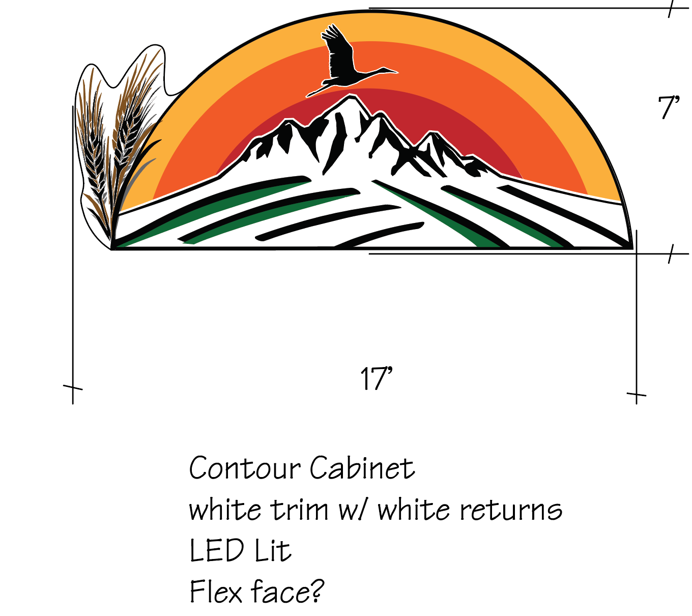
Looking for some design ideas for this convention center.
Wall mounted entrance signage. I don't want birds to nest in the dips of the wheat. It's not my logo, yes it's crap.
What if the wheat was cut steel and stood off from the cabinet? Any other recommendations or thoughts would be helpful. Criticism welcomed on this one.
