• I want to thank all the members that have upgraded your accounts. I truly appreciate your support of the site monetarily. Supporting the site keeps this site up and running as a lot of work daily goes on behind the scenes. Click to Support Signs101 ...

DISTRESSED SIGN logo in Photoshop

M D Gourley

New Member
Hello everyone,
I client wanted a new sign with a distressed logo around their new premises and on their old vehicle....errr, not having done that type of signage before and feeling a bit lazy at creating multiple distressed signs...LOL...I thought it would be...well, easier and more cost effective to do it in Photoshop then Digital Print and Laminate the signage...the result below.....definitely needs more work to perfect...lol
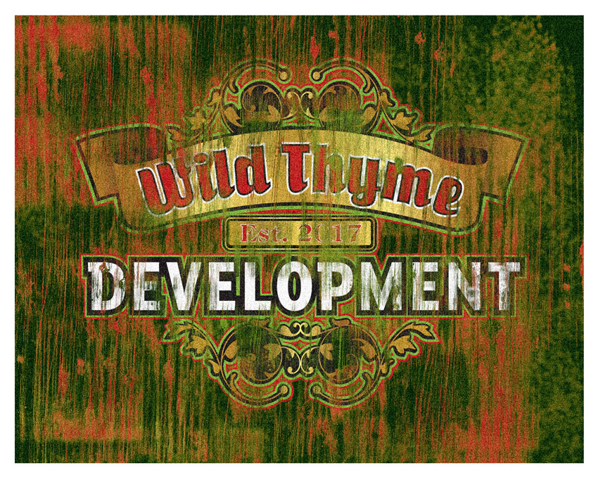
WILD THYME distressed logo.jpg
 
Last edited:

bob

It's better to have two hands than one glove.
It doesn't look all that distressed, rather it looks like a shiny new sign upon which someone cleaned a couple of paint brushes.
 

bannertime

Active Member
Personally, I think the colors are too bright for a distressed look. How can you have a sign that looks like a 100 years old, but the white is pristine. Ya know? Looks odd.
 

Texas_Signmaker

Very Active Signmaker
I agree, it doesn't really look right.

You used a sharp looking font, and they have "distressed" fonts that have a good weathered look... I actually just built one this morning and will be installing it in a week or so. Search for "rustic" fonts.

Also, the green weathered look just isn't jiving. I duno, I can't really put my thumb on it.
 

BALLPARK

New Member
Like anything a designer does... the more times you make it the better you get at it. It does not look bad, but it does look new in areas for that weathered style. I would look for plenty of rustic, vintage, and/or distressed vector for the fonts, backgrounds, and brush tools. Then use many layers to make the effect with some transparent drops on the actual logo. Good work... just needs a few more runs to hit it. You will know when you hit it.
 

eahicks

Magna Cum Laude - School of Hard Knocks
I've done several of these style designs. You have to make all type faded and distressed, not just overlay some textures. You remove maybe half of what you create in the process. I've seen some cool tutorials on it too, don't have links but they''re out there.
 

M D Gourley

New Member
Like anything a designer does... the more times you make it the better you get at it. It does not look bad, but it does look new in areas for that weathered style. I would look for plenty of rustic, vintage, and/or distressed vector for the fonts, backgrounds, and brush tools. Then use many layers to make the effect with some transparent drops on the actual logo. Good work... just needs a few more runs to hit it. You will know when you hit it.
Thanks for the tips...this is my first go at this and it is still not there yet...more practice needed for sure:)
 
Top