Gino
Premium Subscriber
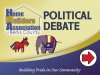
I was just called for 36 of these directionals. The arrows will be cut-out vinyl and they'll paste them on how they see fit in the various locations.
Everything here was dictated as to how they wanted everything to look, except I had my choice on the two words 'Political Debate'.
They wanted their logo large, they wanted the donkey and elephant small, they wanted the words at the bottom that size, they wanted the colors and fades as you see them and they wanted an arrow on each one. Most are double sided except for 6 of them, which will be 1-sided. I'm getting a good price for them... over $40 each plus step stakes, so if I need to change anything, I have some time I can kill on this.
My problem is..... there is something that looks off about it and I can't figure out if it's the cartoonie animals or the many fonts being used or just the various elements varying sizes.
I know they're only gonna be used for one evening and it's only a directional, but I want them to be happy with them.
So without getting political, can we keep this from being locked down ??

 Gino
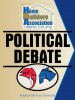
Gino
Everything here was dictated as to how they wanted everything to look, except I had my choice on the two words 'Political Debate'.
They wanted their logo large, they wanted the donkey and elephant small, they wanted the words at the bottom that size, they wanted the colors and fades as you see them and they wanted an arrow on each one. Most are double sided except for 6 of them, which will be 1-sided. I'm getting a good price for them... over $40 each plus step stakes, so if I need to change anything, I have some time I can kill on this.
My problem is..... there is something that looks off about it and I can't figure out if it's the cartoonie animals or the many fonts being used or just the various elements varying sizes.
I know they're only gonna be used for one evening and it's only a directional, but I want them to be happy with them.
So without getting political, can we keep this from being locked down ??
Gino