-
I want to thank all the members that have upgraded your accounts. I truly appreciate your support of the site monetarily. Supporting the site keeps this site up and running as a lot of work daily goes on behind the scenes. Click to Support Signs101 ...
You are using an out of date browser. It may not display this or other websites correctly.
You should upgrade or use an alternative browser.
You should upgrade or use an alternative browser.
Excavating company logo...
- Thread starter Pixels Are Bad Mmmkay?
- Start date

SignManiac
New Member
Not too bad. Something crooked looking going on with the font. Maybe a different one?
SignosaurusRex
Active Member
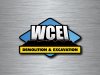
I like the direction you are going. The WCEI almost represents a Dozer blade. Maybe a few tweaks to that itself might finish it off nicely.
Pixels Are Bad Mmmkay?
New Member
Not too bad. Something crooked looking going on with the font. Maybe a different one?
I'm pretty sure it might be because of the W. Is that what you are referring to?
Instead of using Impact font like I did here, I initially toyed with the idea of drawing the W with squared up sides and something about it just didn't jive right, you know. It looked like an upside down M. But I will try out a few more fonts and see if something else strikes my fancy. I know the few fonts that I have installed with square W's have too much of a retro feel. M first impulse was to try to stick with Impact font because it's the font that he used for his old logo. He wants it redesigned as the company's name is changing. He's a big guy that drives a Ford F-650 and somehow Impact seems to fit him and his companies image. It might not look as bad had I not added so much perspective, but I like the way it looks like a shiny bulldozer blade pushing dirt.

Pixels Are Bad Mmmkay?
New Member
I like the direction you are going. The WCEI almost represents a Dozer blade. Maybe a few tweaks to that itself might finish it off nicely.
Yeah, my thoughts exactly.
Pixels Are Bad Mmmkay?
New Member
I'm gonna have to agree with Bob, I am not agreeing with that font. Other than that I think it looks really good!
Could it also have something to do with Impact being an overused font? It's not exactly my go to font, either. Should I be looking more for slab serif block style here? I tried some collegiate stuff...some Rockwell...some Romeral...nothing seemed to jive.
Any suggestions for a more suitable font? Signasaurus? You know fonts like grandma knows apple pie.