-
I want to thank all the members that have upgraded your accounts. I truly appreciate your support of the site monetarily. Supporting the site keeps this site up and running as a lot of work daily goes on behind the scenes. Click to Support Signs101 ...
You are using an out of date browser. It may not display this or other websites correctly.
You should upgrade or use an alternative browser.
You should upgrade or use an alternative browser.
Finally lol
- Thread starter laserman70
- Start date

J Hill Designs
New Member
that should turn some heads! 
Alti-Plotter
New Member
Nice. Thank you for showing your work.
SignManiac
New Member
Back looks great

laserman70
New Member
looks good, but i have to ask with your logo.... why does the "wra" slant to the right at different angles with each letter and the "ps" do not slant at all? it keeps catching my eye and making me wonder
The w started the slant. the A had the same slant so I made the r slant to follow instead of just using the font standard. Wanted to create something that would catch the eye.
Lots here dont like it, but we do and people recognize the logo around here so I dont want to change it now. lol
Thanks for the inquiry and the nice comments all.
Craig Sjoquist
New Member
The back looks GREAT.
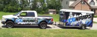
The truck and side of trailer FAIL ... even though you do some awesome work compare this to other work seen you have done, you seemed to have forgotten basics.
Notice the contrast on back of trailer. The main place your eye goes is the car then your logo even though on top also no over kill on trying to get logo to be seen and readable.
Notice the side of truck and trailer background & logo compete and neither is contrasting enough understand, thumbnail tells it all.
Sorry thinks you do some great work but if you ask I'll tell ya what I think. I also think you can do alot better.
HulkSmash
New Member
The back looks GREAT.
The truck and side of trailer FAIL ... even though you do some awesome work compare this to other work seen you have done, you seemed to have forgotten basics.
Notice the contrast on back of trailer. The main place your eye goes is the car then your logo even though on top also no over kill on trying to get logo to be seen and readable.
Notice the side of truck and trailer background & logo compete and neither is contrasting enough understand, thumbnail tells it all.
Sorry thinks you do some great work but if you ask I'll tell ya what I think. I also think you can do alot better.
what..? The contrast is fine.
John Butto
New Member
Looks great, layout art, everything and really like your wheels on the pickup
Locals Find!
New Member
I don't like the trailer back. It looks like you shot it from the inside out (I say that because in the back to the right seems to be a crack that appears to me to be outside) and put the car in but the whole thing is skewed to the right the car & picture. I mean you installed it straight but the whole angle of the shots are all off.
Look at the lower right of the car wheel and the mirror on the right side and you will see what I am talking about.
Look at the lower right of the car wheel and the mirror on the right side and you will see what I am talking about.
Ghost Prophet
New Member
Absolutely awesome... until I saw the car. 
Agreeing with a bunch above, angle on the car trompe l'oeil is off and the car should be wrapped as that's what you're advertising. Right now you're just advertising an expensive car.
The tag line (Design & Graphics) does need more contrast, especially on the truck. Don't like the half-wrap effect on the truck (the white tribal graphic and white top), should have carried the design through from the trailer. Looks unfinished or like an afterthought.
Otherwise, better than a lot of shop trucks as the main point is simple and large, not over complicated with lists of services and other bollocks.
stickermonkey
New Member
I love it ! All of it ...Cheers!!
All of it ...Cheers!!tattoo.dan
New Member
Looks great to me! Especially the back!