-
I want to thank all the members that have upgraded your accounts. I truly appreciate your support of the site monetarily. Supporting the site keeps this site up and running as a lot of work daily goes on behind the scenes. Click to Support Signs101 ...
You are using an out of date browser. It may not display this or other websites correctly.
You should upgrade or use an alternative browser.
You should upgrade or use an alternative browser.
First One
- Thread starter Williams Signs
- Start date
SignosaurusRex
Active Member
I really hope my eyes deceive me! It looks like a Level was not an item put to use.
....oh .......I just realized your biz name.
....oh .......I just realized your biz name.
d fleming
New Member
ditto
The level, well, I could live with, but the kerning....... there is none.
SignManiac
New Member
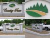
Well since you did ask. Not too bad for a first one. The monument is just ok. But you layout really needs work. The logo and lettering look like they were just stuck on any place without any consideration for negative and positive space, nor how any of it would relate to the shape of your monument.
The separation between the logo and name is way too much. In fact, you eye is drawn to that nice big white hole in the middle of the sign. You need a focal point to pull the viewers eye to. By closing up that huge gap, the logo now relates to the name and the gained positive space around the format balances out with the rest of the monuments shape. You also could have bumped trace over a little closer to Country.
Here's a quick example of what I'm talking about.
Attachments


SignosaurusRex
Active Member
The level, well, I could live with, but the kerning....... there is none.
I agree about the kerning......but seriously, you can live with it looking like it sank 10" on one end?
Attachments

signmeup
New Member

mountainmang
New Member
i think it looks nice for your first one...and i'm guessing a little mulch and flowers will make it look pretty level
Malkin
New Member
I agree about the kerning......but seriously, you can live with it looking like it sank 10" on one end?
I think it is level, but the parking lot slopes down, away from the viewer.
kstompaint
New Member
I agree, it's only the last shot that appears that way. Otherwise it looks ok.I think it is level, but the parking lot slopes down, away from the viewer.
I think the critiques here have some merrit, but I've done plenty of projects that were not layed out to my satisfaction. Sometimes it's out of your hands... as long as the guy who signed the check is happy you're golden.
Some great and worthy comments here so far. Congrats on getting into this side and for first shot... not bad.... rating out of 10 for materials used, possibilities, end result: 3
My problem is this:
Whilst yes technically it is a dimensional sign, you could have done SO much more with this.
Consider: The logo of trees and pathway etc could (should) have been done on three layers. Depth of field is important in dimensional signs. Consider that all you can see side on to the logo is a 12mm piece of HDU. Get them chisels out man and chamfer the edges. Give the trees definition, some forward, some back. Paint with varying shades of light and dark green. Undercut where appropriate.
Chamfer the pathway so there is greater height at one end. Same with the grass. Stipple some yellow and grey/black to give more depth.
The pictorial could have been a little larger and definately followed the curve of the monument.
The text is standard and could have been "boosted" by some manipulation. A little higher and you could have used the "y" to put a fancy ar$e swoosh underneath the text. Not too heavy - it's only a dressing. The keyline is way too heavy.
Could possibly have introduced a third colour into the side inlays. Even varying shades of grey would have "popped" this.
I am truly not bagging this effort. Maybe I am bagging the lack of extra effort that could have gone into this to make in a truly great sales tool for future monuments. You NEED to have people say "wow - I want one of those".
Break it down, do some research, look at the (unfortunately finished) sign and ask "What could I have done to make this better".
Hope this helps
Cheers - G
Shovelhead
New Member
What are the black splotches in the trees?