• I want to thank all the members that have upgraded your accounts. I truly appreciate your support of the site monetarily. Supporting the site keeps this site up and running as a lot of work daily goes on behind the scenes. Click to Support Signs101 ...

First Partial Wrap

JMPrinting

New Member
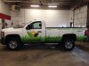
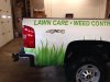
Hey everyone. I open a shop last May and this is my first partial wrap and first time using 3M ControlTac on a project. I know you don't discuss pricing on here but if a PM could be sent on an estimated price for print and design that would be great. I've already charged and I did some research but I want to make sure I'm not too high or low. Anyways, here it is. I'm open to criticism, suggestions...ect.
 

Attachments

  • image.jpg
    image.jpg
    55.9 KB · Views: 120
  • image.jpg
    image.jpg
    46.9 KB · Views: 123

bikecomedy

New Member
Hope the black lettering is removable and you can redo it before you send it out the door. Barely readable. Imagine you would have to be relatively close to read it. Could not read or figure out the web url.
 

JMPrinting

New Member
We did remove the 4x4 after. The text is more readable in person but I think I'll agree that it could be more visible
 

Laz0924

New Member
Job looks good, should have used white letters or outline on the grass but if the customer likes it call it a close call and learn for next time. I wouldn't re-due it unless the customer complains.
 

phototec

New Member
Looks good except for the hard reading text like others have mentioned, you need to remember your job is to make the graphic on the truck legible so the customer gets business from his partial wrap investment. If the message (name or phone number is hard to read), you are NOT doing a good job for your customer.

The contact information is much more important than a pretty logo!

I think partial wraps are a win-win situation, good value for the customer, the get a rolling billboard (who needs to cover the hood and the top of the truck anyway), and it's an easy product for your shop, and easy install.

:thumb:
 

Craig Sjoquist

New Member
Sorry for the customer ...Waste of money, if this is what they get, change the black copy to white at your expense, then someone can at least read who they are.


Do not mean to be so harsh, but geez.... Professional means more then ya got a bunch of equipment & ya can push buttons in a graphic software, Myself I have to compete with garbage like this & lose out because I do not have all this fancy equipment & software.

Does anybody go to school anymore, just because ya maybe creative or know what may look good, schools will let you see guidelines & how to bring it out to what works in real.

Excuse the rant.

Glad to see ya trying & at least is looks sorta clean, wish ya luck.
 

SignManiac

New Member
Contrast is essential to readability. Using the best materials or doing a great install is will never compensate for any design flaws. Hopefully the above critiques will help you in the future.
 

CES020

New Member
Doesn't look too bad for a first wrap. As already mentioned, the black is a issue. My input would be to lose the giant white space around the blades of grass. On the tailgate side, near the rear wheel, it looks like you have 3" of white space on each side of each blade of grass. If you needed ANY whitespace, I'd make that a lot less, like fractions of an inch.

Hopefully you learned a lot from this one, good job for giving it a go and sharing it with us.
 

Marlene

New Member
the wording looks like you slanted some of it but by the time it gets to snow removal it isn't slanted any more. is this how it really looks or is this some kind of strange thing going on in the photo? did you design this or did they? reason I ask is the leaf thing is OK but so huge compared to the company name. not going to beat you up over the black lettering as I will for how crunched and squeezed the name looks. it also looks like an after thought. it looks like the truck was done and someone said, ooops we forgot the freaking name, lets shove it in down here. if you didn't design this, did you at least let them know that putting the name up on the door is a much better idea than putting it down where it will be covered by muck most of the time? if you did design this, think about that for your next truck
 

bikecomedy

New Member
Would suggest not letting this go out. It will last for some time and thereby it will showcase your work. It will become someones Before and After. You and the customer will both suffer.

Marlene makes a good point about the leaves. To big in relation to the name. Curious if you designed this why there is no play on TNT? Landscaping Dynamite! Less forgetful than TNT Landscaping. Explosive results! Blah blah blah... anything fun and catchy, something especially memorable.
 

Marlene

New Member
Curious if you designed this why there is no play on TNT? Landscaping Dynamite! Less forgetful than TNT Landscaping. Explosive results! Blah blah blah... anything fun and catchy, something especially memorable.

I wondered about that name too as it seems like they went out of their way to come up with a name and then, fizzled out on doing anything with it. I think we really need to know who designed this
 

shoresigns

New Member
Easiest way to fix the black text would be to cut some white vinyl letters the exact same size and put them 1/4" up and to the left, so you have white lettering with a black drop shadow.

I like the grass though. What a cool idea for a landscaping company.
 

dawg

New Member
grass a great idea.. looks ideal the covered - uncovered area ""balance""

the 4x4 logo even its part of the truck, its killing your great design..
in my very private opinion even a ladybug would be better than the 4x4 logo.. but its pending on customer..


i think logo wellsized and colors are matched very well..

the text i can not comment because light is way less than outdor natural light..
would be interesting test a spinach green or lighter green lettering with a faded outline

i think with this quality you get more customer easy..

i know it sounds weird... but using only shades of a color can make a good contrast...
i made some quick coloring to show i thinking... might be a little fading around?
 

Attachments

  • green txt.jpg
    green txt.jpg
    24.5 KB · Views: 129
Last edited:
Top