• I want to thank all the members that have upgraded your accounts. I truly appreciate your support of the site monetarily. Supporting the site keeps this site up and running as a lot of work daily goes on behind the scenes. Click to Support Signs101 ...

Fitting text on wave shape? Joe Diaz if you're out there!

SignManiac

New Member
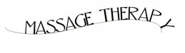
Ok, long time CorelDraw user. I use the envelope tool a lot for some text distortions but can't seem to find a way to fit my text along this example without breaking each letter apart and then manually placing it on the curve. Then you have to manually skew each letter to follow your curves and afterwards adjust the kerning and recombine your text.

Is there a trick that I've missed all these years?
 

Attachments

  • massage.jpg
    massage.jpg
    19.4 KB · Views: 121

CP Signs

New Member
Click on the text tab on top, down to fit text to path, position your text, convert it to curves and move it how you want it.
 

CP Signs

New Member
You can normally move it around untill you like it's position,,,, sometimes depending on tbe size of the file, it acts funny like that and you have to move the mouse very slowly
 

SignManiac

New Member
Moving isn't the issue, keeping each letter vertical and not slanted to the angle of the arch is the problem.
 

Joe Diaz

New Member
After you have fitted your text to path, in your properties bar you will notice a drop down selection with an image of an ABC on an arch. There are a few more options that may be helpful there. Sometimes I have found using a combo of "fit text to path" and "envelope" or even the shape tool is needed to fine-tune a design I'm working on, especially if the path you are following is more complex. Keep in mind the computer can do lot's of things automatically, like kerning for example, but when there are so many factors at play, sometimes it takes a human touch to do it right, doesn't matter what software you use.
 

SignManiac

New Member
As I suspected. Thank you Joe! It's not really to difficult to do using the method I did it with, but I figured I might learn something new. Appreciate the help.
 

WildWestDesigns

Active Member
After you have fitted your text to path, in your properties bar you will notice a drop down selection with an image of an ABC on an arch.


I wonder why Corel doesn't use the "Any Shape" tool that Wilcom has (since they are partnered together) and use that. I had done a jacket back design that had pretty much that same shape as your banner and it makes creating those type of text paths a whole lot easier.

I just don't see why Corel wouldn't add some tools from the Wilcom side of things to their program.
 

SignManiac

New Member
A long long time ago, I used Design Art by Anagraph and I'm pretty sure they had a distortion tool that would create that same effect. I'm fairly certain there are some software companies that can do it. I am really surprised that Corel hasn't come up with it yet.
 

WildWestDesigns

Active Member
I am really surprised that Corel hasn't come up with it yet.

I am too. Since x4, Corel has been "in bed" with Wilcom (my digitizing software of choice) and unless something prohibits this in their partnership agreement (which is possible), there are a lot of functions that Corel could take that would make it vastly easier to do certain functions of Ai. There are functions in my embroidery software that are vastly superior as far as efficiency goes (offsets and lettering functions (such as this one) to name a few), that I'm surprised that Corel hasn't taken advantage of. Especially since you can do things in regular graphic vectors even being in embroidery mode (even the bezier tool is more efficient in the embroidery program versus Ai and/or Corel). I just don't know why Corel hasn't take advantage of this partnership more.
 

TammieH

New Member
Also make your path longer than needed, the font is being squeezed on too short of a path, it will give you more room for kerning as well.
 
Top