• I want to thank all the members that have upgraded your accounts. I truly appreciate your support of the site monetarily. Supporting the site keeps this site up and running as a lot of work daily goes on behind the scenes. Click to Support Signs101 ...

Flexi Color Help...

Idea Design

New Member
I hoped to never have to ask any questions about color profiling and calibration and all that after I got my printer.... but I can't figure this one out.

I have used illustrator and photoshop since 1998, and I'm pretty confident with my abilities in both programs. I slowly started to understand color theory, the differences in spot, lab, cmyk, rgb, and the various things that affect each of these.

Then I got Flexi.

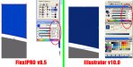
I'm not sure what the problem is, but I've screen-shotted both programs to show that, without question, I don't know what the hell I'm doing in Flexi. The attachment shows the same object selected in both programs, and the color mixer palette in both. You'll see that the cmyk percentages are exactly the same, but clearly the color is displaying differently.

If it matters, the color that illy displays is the actual color. This logo has been run as spot colors for business cards, brochures, etc. The PMS color for the blue is Pantone 288C.

Any help is appreciated.

:help:
 

Attachments

  • WTF_color.jpg
    WTF_color.jpg
    135.9 KB · Views: 179

PMG

New Member
Check under the view drop down to see if your have soft proof checked,,if so un check it.
 

Idea Design

New Member
Thanks Pro...

I looked and it turns out that soft proof was not checked, so I checked it, now the colors are much closer.

BTW, my new setup is exactly the same as you have, except for the laminator. I'll be paying attention when you post.

Thanks for the help.
 

PMG

New Member
no problem, on mine if it is checked the colors on screen are milky,and if i
uncheck it the colors are true.
 

Matthew Scher

New Member
Illustrator defaults to a softproof design preview, Flexi does not. Turning it on in Flexi will make colors much more close to Illustrator, but not exact as Flexi defaults to a different output profile.

You can get the screen results to be closer by selecting the exact same ICC profiles inside Edit>Color Settings (browse for the one installed with AI), or you can turn off the softproof in AI to match Flexi.
 

signguy95

New Member
Yeah you really need to calibrate your monitor or use the same monitor profile in all programs to get the same color between apps.


Jay
 

Idea Design

New Member
You can get the screen results to be closer by selecting the exact same ICC profiles inside Edit>Color Settings (browse for the one installed with AI), or you can turn off the softproof in AI to match Flexi.

This instruction, I assume, is with soft proof checked in Flexi, yes?

I matched the monitor profiles in each program, and I got nuthin' even close without turning soft proof on in Flexi, and then they were merely close not exactly the same.

I didn't notice how "milky" the colors were in Flexi until PMG mentioned it. I still don't understand why flexi displays a color that is nowhere near the actual color that's in the design.

Without soft proof, trying to get acceptable output by this method would be like searching for a needle in a haystack after a bottle of whiskey at night outside in the winter when it's -20°, wouldn't it?
 

schurms

New Member
I have seen different software give different color profiles to your printer. I have over come this by using the same software, in my case Photoshop and will give you good results. All software seems to have its own input profiles. I have matched my computer screen to my input files and my printer.
 

Idea Design

New Member
I guess I still don't understand why a $4000 program doesn't display somewhat accurate colors right out of the box.

Why would one want to work in an environment that displays colors that are not even close to the actual color without turning on soft proof?

Am I missing something? I just doesn't make sense to me, the logic behind it all. With a somewhat basic understanding of color, be it on monitor vs. printed, you open Illustrator or Photoshop, right out of the box, and obtain color on-screen that's relatively close to actual printed color; I just can't wrap my head around it.

I sound like a babbling fool, maybe the voices in my head are irritated.
 

Matthew Scher

New Member
Softproof adds a delay to redraw (when you move or resize something for example) and many users don't want dull colors on screen, especially when they are cutting vinyl. So we default to off.
 

Idea Design

New Member
Thanks Matthew and schurms. I don't mean to sound like an ingrate or a smart-ass, but why have soft proof at all? Why not display more accurate color without?
 
Top